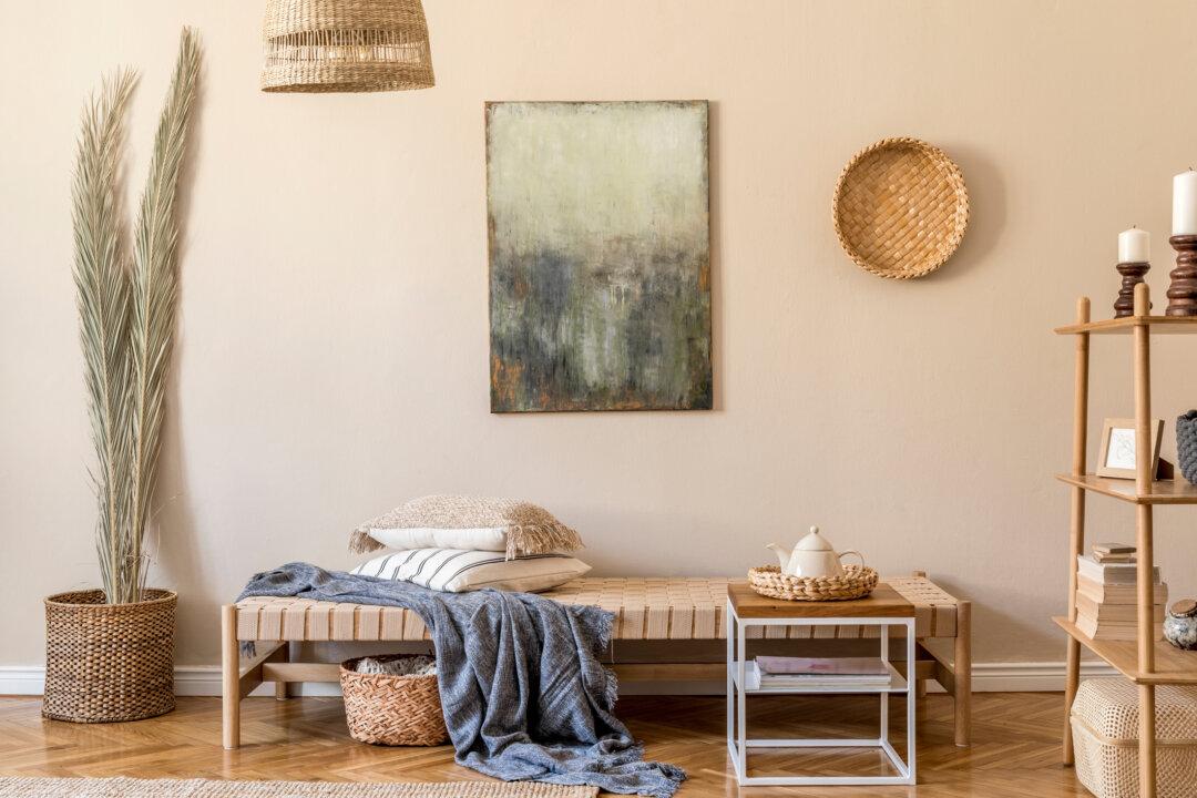
Here’s a quick breakdown of what they had to say:
Create a Color Scheme
First, select colors from objects in your living room.
“Take a pillow from the family-room sofa, your favorite tie or scarf, or a painting—anything that conveys comfort or has an emotional connection for you—and take that object to the paint store,” Architectural color consultant Bonnie Krims told This Old House. “Find three sample strips with those colors, and you instantly have 15 to 18 colors you can use, since each sample strip typically contains six paint colors.”
Next, choose a paint color from the trio of options. This will be your wall color, while the other two colors can be used around the room through fabrics and furnishings.
Don’t Overcomplicate It
Krims is not the only expert that believes in the importance of a good color scheme. According to Behr Paint’s color expert and vice president of color and creative services Erika Woelfel, sticking to a color scheme is a simple way to keep things practical.
“Be sure that your wall color doesn’t clash with focal points throughout the room,” Woelfel told My Domaine. “A general rule is to stick to one palette of three to five colors. One white or light color, one to two neutrals, and one or two supporting colors.”
Too many colors can be a pain on the senses, especially after a tiring day at work. Stick to a simple, yet effective, color scheme to make the most out of your living room paint color choice.
Consider Earthy Colors
Bright colors can look dazzling on a paint chip or color swatch, but going bright can be a bad idea.
“The biggest mistake people make, especially when they’re staring at a wall of paint swatches, is they end up going too clear with the color—like a kid’s crayon blue instead of something a little bit more muted and sophisticated,” Rebecca West, founder of Seriously Happy Homes, told Apartment Therapy.
While bright colors can be used effectively in the home, utilizing them as living room paint colors often requires expertise. West contrasted a jar full of jelly beans and a jar full of beautiful river rocks to help explain the conundrum.
“They are both full of gorgeous color, but those natural hues are going to be more timeless, long-lasting, and easy on the eyes,” she said.
Copyright 2023 The Atlanta Journal-Constitution. Visit at ajc.com. Distributed by Tribune Content Agency, LLC.