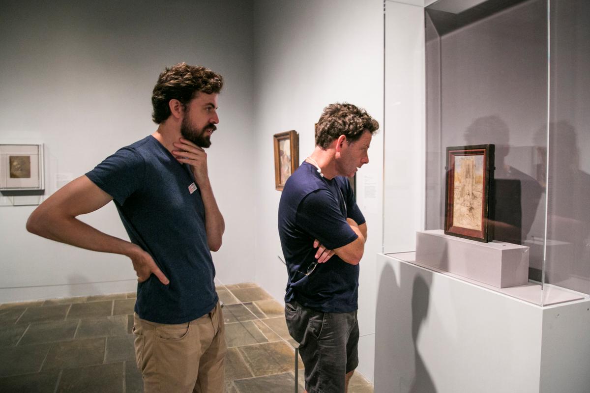
NEW YORK—A realist painter encouraged me to see The Met Breuer exhibit, “Unfinished: Thoughts Left Visible.”
“It’s phenomenal! You have to see it,” I was surprised to hear him say.
Then he specified, the third floor is the must-see part of the exhibit. The fourth floor has some candy you could try—a dwindling, colorful pile left in a corner as a Felix Gonzalez-Torres installation.
The Met Breuer is the Metropolitan Museum’s annex for modern and contemporary art, on Madison Avenue—the former home of the Whitney Museum. It’s not necessarily the most inspiring, not the first-stop museum for the enclave of artists I’ve been interviewing, who have been trained in the atelier tradition of the old masters.
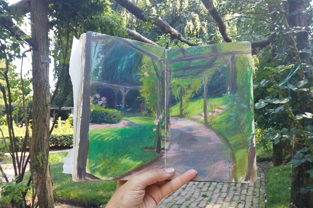
Artists in the atelier art movement draw, paint, or sculpt from life. They have keen visual perception and can tell at first glance if a painter used photographs, or not, to create a piece—even if it was a painting made in the late 1800s.
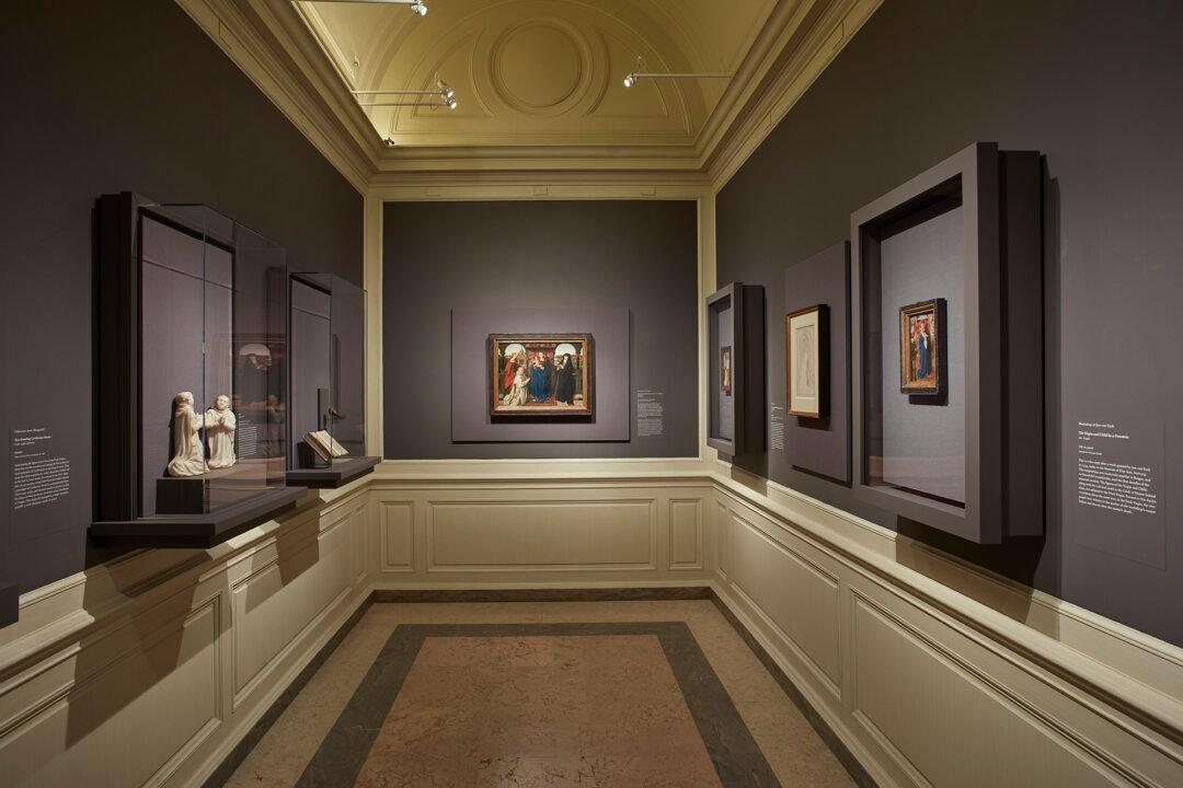
“Unfinished” is a grand sweep, showing works from the Renaissance up to today. The third floor shows unfinished works by masters like Michelangelo, da Vinci, Titian, Rubens, Rembrandt, Velazquez, van Eyck, Turner, Mezel, Sargent, and so forth—more than enough to make one gasp, amazed by the concentration of genius creations to be absorbed. The fourth floor starts with works by Picasso in the 1920s.
The third floor is especially fascinating for realist artists because it shows the thought processes of the old masters that they admire so much. The entire exhibit shows two kinds of unfinished works: those that are literally unfinished, due to death, a commission interrupted, or some other unforeseen reason; and those that were intentionally left to look unfinished. This distinction almost becomes irrelevant for the pieces displayed on the fourth floor—such as a dwindling pile of candy.
Encouraged to see the exhibit and especially eager to learn more about the old masters, I joined a gallery talk. But the guide only talked about three pieces on the third floor—more modern-looking works by El Greco, Leucian Freud, and van Gogh—and for less than 15 minutes. The rest of the hour was spent on the fourth floor.
When I told the guide that I was hoping to learn more about the old masterworks on the third floor, she said time was limited. After I asked her if it was a matter of time or interest, she said it was a little bit of both, that she only had an hour and so she had to pick and choose. I gathered that The Met Breuer is, after all, a modern contemporary art museum.
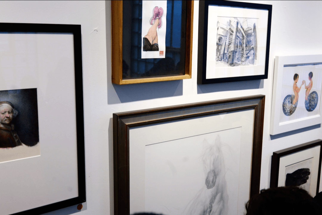
Left rather unsatiated, I decided to invite realist artists to share their thoughts about the masters’ unfinished works and how it might influence their current work.
I see it as one-way conversation between the old masters and living artists. We can no longer hear the old masters speaking, but they can still communicate viscerally and quite directly with living artists who are continuing this timeless realist tradition.
“Unfinished” is the kind of exhibit that engages your imagination. As Peter Schjeldahl wrote in The New Yorker, “You will want to think out loud about what you encounter.”
It was a special treat to listen to these artists talk out loud about “Unfinished,” better than candy, and I wanted to share it with you, dear reader. So I hope it will encourage you to see the exhibition before it closes on Sept. 4, and to appreciate the living artists who’ve contributed to this article.
Jacob Collins, Artist and Founder of Grand Central Atelier, on Rubens and van Eyck
I’m struck by, looking at a lot of these unfinished paintings, how incredibly un-carefully they drew before making such careful paintings. Though I expect that from Rubens, because he was such a virtuoso. The foreground was pretty roughly drawn, considering the degree of finish that these paintings have, as shown in the background.
It would be a lot more fun to paint like this than how I paint.
I think the curation is leaning to show the open and somewhat wild underpaintings, the fresh initiation, possibly because that is a modern enthusiasm. Nevertheless, it makes me feel like there’s greatness and freedom in the way some older artists would start paintings. Looking at them now makes me want to do that too.
When I was a kid starting out, I painted more like this, but I certainly didn’t have the chops to be able to turn them out OK—the paintings would fall apart. I couldn’t hold together the structure, the drawing, the color, and the composition all on the fly. So I became a much more fastidious and patient artist, which goes a little bit against my natural personality.
A lot of the resolution was developed in the painting stage of this Rubens. I’ve gotten so much in the habit where I’m resolving things in advance—in the drawing stage—which is also a great way to work.
Clearly van Eyck was resolving the position, the structure, the volume, and the perspective of everything in that dry point undertone, whereas in this Rubens everything is fluid; it’s wildly uncertain where things are going to end up.
It speaks to a lot of us [realist artists], to two different sides of our creative desire. I certainly feel a strong pull in both directions. I see that van Eyck, and I think, why can’t I be more careful? Why can’t I have more of that richness and intensity and that highest attainment of perfection? And I walk 35 feet over to see this Rubens, and I think, why can’t I have more freedom?
There are a lot of incredible artists, like van Eyck, Ingres, Rubens. It’s not as if one is better than the other.
Edmond Rochat, Painter, on Menzel
This is a rare gem, this opportunity to see so far beyond the layers of paint, peeled back, to this initial drawing. It shows the undercurrent and the foundation of visual thinking in a representational way.
As soon as you begin to think in terms of perspective, you begin to think in pictorial space, and Menzel is just a prime example of that. The extent to which he planned out the details, the space, and the setting is phenomenal. It’s fascinating to see he didn’t just do a contour line that’s very specific and then transfer it. He planned it out spatially before considering the light and shadow.
Even better, we can see these partial ébauche sections and how he began to paint over his drawing. And more obviously, you can see so much more detail in the niche with the candlesticks, which is presumably what the rest of this painting would have looked like had he continued.
Menzel’s sense of value is unbelievable. Even that man in the back, although it is a bunch of swatches of paint, it’s already getting this beautiful light effect on it.
This drawing of a person’s head [on the left side of the altar] has a little tick mark below at the chin and another one above at the top of the head. When you are thinking about perspective you have to have your unit of measure to which you project back to, and Menzel probably used that as a scale.
The extent to which the old masters understood these concepts, how they designed pictorial space so thoroughly, always astonishes me. It’s so mesmerizing that even though you know it’s not magic, you just can’t help but think it is magic. How can anybody do that? As an artist, you tell yourself, there must be something he knows that I don’t know.
Obviously, it was a different time, and you are always discovering little things about the old masters, but look, we have perspective, and here it is in plain view. It’s just that they were so brilliant at it and they thought about it so rigorously and creatively. That’s the secret. If anything, it pushes me to want to reach that level, to go back to my studio and work harder.
Jordan Sokol, Painter and Academic Director of The Florence Academy of Art–U.S. Branch, on Titian
Looking at “The Flaying of Marsyas,” we are essentially witnessing a violent death. It’s incredible to look at this Titian painting and to imagine what was going on in his life. He’s in his late 80s or 90s [we do not know his exact date of birth], at a time when there’s a plague that wiped out almost a third of the population of Venice. It’s incredible to imagine him in that context, how that must have impacted him, and how that is coming through in the way he’s portraying death.
On top of that is Titian’s use of paint. The way his painting evolved stylistically was incredibly unique and innovative. Nobody painted like him before him. He’s painting with big broad brushstrokes; it’s very loose and atmospheric. Figures melt with the background, edges bleed into one another. The painting looks very abstract up close, yet holds together from a distance.
These are the seeds of impressionism. He’s inventing this. It’s eventually what inspired Rembrandt and Velasquez.
That’s inspiring to me because what it means is that at a certain point he transcended what he was painting. He’s building a relationship with paint that’s independent from the subject matter. It enhances the subject matter because it obviously adds to the emotionality of it.
That is huge, because I am seeing how a whole other dimension of painting can be explored. It opens up a whole new doorway to the exploration of what can be done with the medium itself. How do I find that balance between what I’m painting and how I’m painting it? And how do I enhance what I am painting through the way that I paint it? It inspires me to push the boundaries of the use of paint as an abstract language.
I find that the more hours that go by when I’m painting a model, the more I observe and perceive, and the more I start to deconstruct what I am seeing. It becomes so abstract to the point that I feel I am getting closer to the truth of something.
When I look at “The Flaying of Marsyas,” I feel like I’m seeing the truth of something. I’m seeing this artist having such a genuine relationship with paint to the point where he is able to innovate. It just came out of himself. This guy is a monster—a monster master.
Amaya Gurpide, Painter and Principal Instructor of The Florence Academy of Art–U.S. Branch, on Michelangelo and Velázquez
Michelangelo had one of his male assistants pose for the “Libyan Sibyl,” one of the figures he used to decorate the ceiling of the Sistine Chapel in Rome. He exhaustively drew this figure doing many anatomical studies to understand concepts like gesture, perspective, weight, movement, and design.
When you see this drawing you have the feeling of seeing a relic, a document of time.
One of the most fascinating things about it is to think about a time when artists didn’t have pencils like we do today. Michelangelo had to shape a piece of red chalk carefully to create a sensitive line, and the line work in this drawing is absolutely exquisite.
Also, it’s important to notice the scale of this little drawing and think that the actual size of the final figure was three times life size, so these studies were a crucial roadmap for the final composition.
Seeing this drawing helps me connect with the tradition of the old masters and their use of studies as a part of their creative process. These studies were done with precision, investing all of the necessary time and care in a search to thoroughly understand their vision. All that planning is extremely inspiring when you see how much of that gets translated into the final piece.
When I look at this drawing I think about how much the role of drawing has evolved throughout time. Today, even though we still conceive of studies as a part of the creative process, drawing has acquired its own value and has become an independent art form in and of itself.
One of the most relevant things to me about this show is the fact that it’s through these unfinished paintings that we have the opportunity to see and decipher the work of the old masters. For example, in Velazquez’s “Portrait of a Peasant Girl,” you can observe his economical use of line, carefully measured and placed on the canvas to suggest the body and to serve as a guide for his application of paint.
Each artist in this show had a particular way of handling line in their work that speaks of their time and circumstance, and through that their different personalities are revealed. For us as spectators, this offers a terrific document of the past and a way to analyze and enjoy the work of the old masters.
Brendan Johnston, Painter and Sculptor, on Michelangelo
The “Sibyl” drawing stands to me as a challenge: here is what an artist is capable of if every ounce of thought and effort is placed into a singular, magnificent intention. When viewing it, I feel a strange mixture of distraught humility, inspiration, and awe.
It is almost a cliché to choose this piece as a favorite or as particularly interesting, but it’s also a credit to its enduring influence. This small drawing study is a window into the complex and groundbreaking process by which the artist created arguably the greatest work in the history of art, the Sistine [Chapel] ceiling. It is a series of investigative thoughts laid down on paper.
Using his deeply informed understanding of anatomy and the mechanics of the human body, Michelangelo here searches for the power and grace of a pose for the figure he has envisioned. The drawing is the process of realizing what the final outcome will be. Michelangelo never had the intention of “finishing” these drawings. They are so incredibly inspiring exactly because they are so raw and immediate, so close to the creative moment.
Sally Fama Cochrane, Painter, on Drummond
Drummond’s painting shows the opposite contrast to Menzel’s painting: here, there is much less methodical drawing or planning, and yet the finished areas (mostly the costumes) show a convincing roundness—they are illusionistic, three-dimensional forms sitting in space, even though that space has been left unfinished (and in fact is not there yet at all).
For example, Drummond’s understanding of how the pink satin cloth is angled backward into space, while sitting obliquely to the light; or his understanding of how the folds in the green cloth wrap around the body of the figure, in contrast to the lighting, make those figures under the cloth feel solid, and make the pieces of cloth seem to pop off the surface of the panel—they are convincing three-dimensional objects, despite having no background to offset them.
Many artists like to get a basic understanding of the color and value structure of the space in which their objects “exist” in the image, but here Drummond shows that he has that understanding of his objects without any need for a context of the color/value of the backgrounds in which they sit.
This unfinished painting encourages me to hold myself to my highest standard with whatever little piece I’m working on, without making excuses like, “I'll know what this should look like when I put that other thing in over there.” It can look right, it can look excellent, the first time.
Samuel Hung, Painter, on van Eyck
I am simply mesmerized by this piece and can easily get lost in the world van Eyck has created. I’m inspired to be more careful and deliberate with choosing my subjects and to hopefully be able to weave some slice of life elements into my nostalgic paintings.
This painting is so rich in detail from the main subject (Saint Barbara and the tower that will be her prison), to the people depicted in the background doing various tasks of the construction. The contrast between Saint Barbara, who is awaiting imprisonment, and the three women dressed in houppelandes, who are just leisurely visiting the construction site, is striking.
The treatment of space is spot on with regard to the level of detail receding as we move towards the background. The landscape in the very end is a mere sketch but done with enough nuance to describe a specific city, with tree lines and a river flowing through it.
I am assuming it is unfinished—in the drawing/underpainting stage—judging by the super detailed finishes of his more famous pieces: The “Arnolfini Portrait” and the “Ghent Altarpiece.” Apparently it’s debatable whether van Eyck left this piece unfinished on purpose because of his fine brushwork and also his signing and dating on the painting.
I love this rare gem of a piece, to see so much care and attention to detail just for the preparation (if that were the case) of a painting. A must-see!