The Theatrical Art of Designing Space

The Theatrical Art of Designing Space
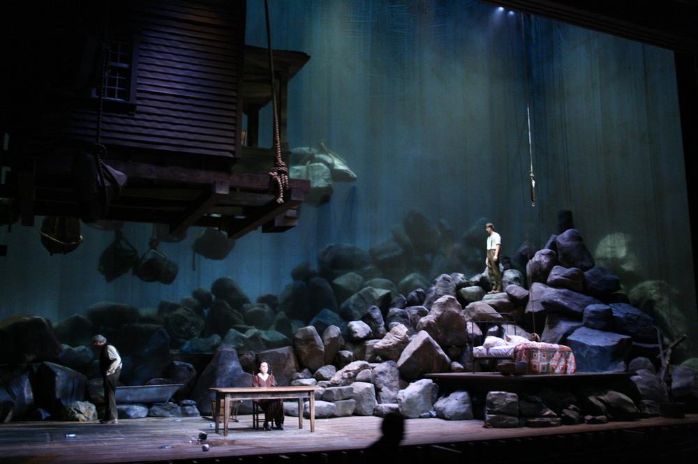
Using startling imagery of huge boulders and a whole house hoisted above the characters, Walt Spangler's set for "Desire Under the Elms" portends the doom resulting from heavy sins. Courtesy of Walt Spangler
Updated:

Most of us never think about how space is designed in buildings, but a theatrical set design is, by its very nature, there for its audience to mull over.

For each play produced, a designer creates an environment—fantastic, realistic, metaphoric, or stylized—that allows the audience to be transported into the world of the play.

Of course, each play presents a unique challenge for the designer. The designer’s first concern is that whatever actions the actor needs to perform are doable. If an actor needs to open a window, the set must have a working window. But just as important are aspects that award-winning set designers demonstrate.

Establishes Time and Place

Whether a play is depicting a fantasy or a historically accurate event, the audience should be able to tell whether the action takes place in a kitchen, a restaurant, a palace, under the sea, or on a cloud. And there should be details that suggest whether we are in the 1650s or in 1935. At the same time, the set tells us about the characters that inhabit the world we are visiting. Are they rich, happy, lazy, or bored?

Christopher Oram’s Set for ‘Hughie’

Written in 1942, Eugene O'Neill’s two-character play “Hughie,” set in 1928 in the lobby of a third-rate hotel in New York, is essentially a long monologue. Erie Smith, a two-bit grafter, laments that his good luck has turned bad since the death of Hughie, the establishment’s former hotel clerk, who always lent Erie a willing ear. The play reveals the human desire for others to see us as more important than we actually are.
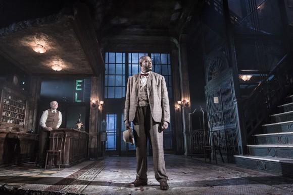
Christopher Oram's set for "Hughie" reveals a once-elegant but now run-down lobby with faded carpets on a dusty floor and a tall window to show how we can aspire but fall short. (Marc Brenner)
Christopher Oram's set for "Hughie" reveals a once-elegant but now run-down lobby with faded carpets on a dusty floor and a tall window to show how we can aspire but fall short. Marc Brenner

British theater set and costume designer Christopher Oram said of designing the set: “Since my first visit [to New York], I’ve become aware that so much of this muscular yet delicately detailed classic architecture is being swept aside in favor of bland steel and glass corporate monoliths, and so when I had the opportunity to explore the style in the design for ‘Hughie,’ I leapt at the chance.

“The set itself, Hughie’s world, is the foyer of a fleabag hotel just off Broadway; it is a transitionary space, neither entirely public, but certainly not private. It represents his state of mind, and the choice he must make. The world outside the lobby has very much turned its back on him, but the stairs that lead to his room lead also to certain death. His character, like, ironically, the architecture itself, is at a crossroads. Though O'Neill gives Hughie a glimmer of hope by the conclusion of the play, I fear the beautiful architecture of New York might not be so lucky.”

Fits the Theater

Just as each play presents a challenge for the designer, so does each theater building, with its unique dimensions. For plays that have a lot of set changes, the problem is multiplied. Where can the designer store all of the items until needed? How can scenery be moved quickly so that the lag time during scene transitions is kept to a minimum?

Scott Pask’s Set for ‘Something Rotten!’

The very funny musical comedy “Something Rotten!" takes an ironic look at the larger-than-life world of theater. Set in South London in 1595, brothers Nick and Nigel Bottom, struggling playwrights both, concoct a plan to outdo the most famous playwright of their time and ours, Shakespeare. They create a new kind of theater—the musical.    

Scott Pask's set for "Something Rotten!" required both outdoor and interior scenes of the house of the playwright Bottom brothers, a platform for the big number for Shakespeare's character Bard (pictured here), and room for the Bottom's theater company, to name just a few of the set changes. As with the trees in the background, Pask used old-fashioned, large cloth backdrops that can be quickly raised or lowered from above to accommodate transitions between scenes. This method not only fits a play set in Shakespeare's era, but also better accommodates Broadway's St. James Theatre, which lacks stage depth. (Joan Marcus)
Scott Pask's set for "Something Rotten!" required both outdoor and interior scenes of the house of the playwright Bottom brothers, a platform for the big number for Shakespeare's character Bard (pictured here), and room for the Bottom's theater company, to name just a few of the set changes. As with the trees in the background, Pask used old-fashioned, large cloth backdrops that can be quickly raised or lowered from above to accommodate transitions between scenes. This method not only fits a play set in Shakespeare's era, but also better accommodates Broadway's St. James Theatre, which lacks stage depth. Joan Marcus

“[The design] implements an economy of means. Internal scenes take place within the overall world of the play, which I call ‘Tudor ghetto’—this downtrodden collage of Tudor buildings and a theater at the center of it. ... But then the shifts that go to more specific location to location are more fully realized. It’s done in a way that the St. James [Theatre, in New York] was set up for, a more vaudevillian manner in which things are flattened and the perspective and the desired depth of space is created with false perspective and through the artistry of scenic painting and sculpting. These elements are used to create great dimension in a very shallow theater,” Tony Award-winning set designer Scott Pask told industry magazine Projection, Lights and Staging News.


Creates a World

Each stage design has its own integrity in the sense that it is internally consistent and presents a complete visual world, which, of course, somehow illuminates the play. 

Walt Spangler’s Set for ‘Desire Under the Elms’

Adapting a Greek tragedy to more modern times, Eugene O'Neill set his 1924 drama “Desire Under the Elms” on a New England farm. In the harsh landscape where the soil yields more rocks than bounty, a son grows up believing his father worked his mother to death. When the father remarries, and the stepmother’s misguided lust centers on the son, sin begets sin and tragedy results.  

Using the startling imagery of large boulders and a whole house hoisted above the characters, Walt Spangler's set for "Desire Under the Elms" portends the doom resulting from heavy sins. (Courtesy of Walt Spangler)
Using the startling imagery of large boulders and a whole house hoisted above the characters, Walt Spangler's set for "Desire Under the Elms" portends the doom resulting from heavy sins. Courtesy of Walt Spangler

“For ‘Desire Under the Elms,’ we wanted the design to evoke the visceral oppression and toil of O'Neill’s New England landscape. While we did not want to literally illustrate the trees of the play’s title, we did want to capture a sort of menacing, hovering feel in the space by hoisting the rocks, and even the house itself, up into the air on giant hemp lines normally used for barges,” said Walt Spangler, one of Broadway’s and regional theaters’ most sought-after scenic designers.

Sets the Mood

The stage design helps set the tone or style of the play, as well as the meaning. Whereas realistic designs keep objects within a moderate color scheme and in proportion to what we see around us, tragedies might call for a formal or lofty tone, and slapstick farce a tone that is exaggerated or cartoonish.

David Rockwell’s Set for ‘She Loves Me’

Probably most familiar as its 1998 film incarnation “You’ve Got Mail,” the musical “She Loves Me“ is set in 1930s Budapest, Hungary, and follows bickering co-workers Georg and Amalia, who discover that their romantic pen pals are, in fact, each other. Finding love in unexpected places adds to the charm of this old-fashioned romantic musical.

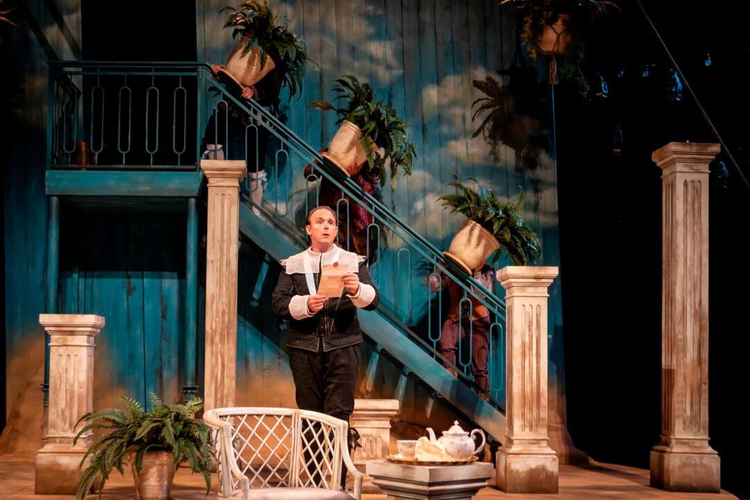
Borrowing from the art nouveau style that influenced Budapest, Hungary, at the time, David Rockwell designed the set for "She Loves Me" with saturated pastels and intricate details, creating a lavish but undeniably cheerful effect appropriate for a romantic comedy and musical. (Joan Marcus)
Borrowing from the art nouveau style that influenced Budapest, Hungary, at the time, David Rockwell designed the set for "She Loves Me" with saturated pastels and intricate details, creating a lavish but undeniably cheerful effect appropriate for a romantic comedy and musical. Joan Marcus

“[The art nouveau period] is just a magical time to anchor the show in. … In some ways, art nouveau is the architectural equivalent to music. It has a lyrical quality, and so much of the music has the beautiful kind of waltz, lyrical quality,” said David Rockwell in an interview with The Broadway Channel.  The American architect and designer is the founder of the Rockwell Group, a cross-disciplinary architecture and design company.

Allows Us to See in a New Way

A visual metaphor, a central image, or a fixed feature on stage can inform an audience and resonate with various meanings throughout a play.

Tim Hatley’s Set for ‘Ghosts’

One of the first plays to document societal ills, Henrik Ibsen’s 1881 play “Ghosts“ exposes the hypocrisy of 19th-century morality. Throughout her life, Mrs. Alving has portrayed her long-dead husband as a decent and loving man. This facade ultimately hurts the person she loves most, her son, Oswald, who now suffers from his father’s indecencies.  

Tim Hatley's masterful set for "Ghosts" has transparent walls that let the audience see the actions of the past, such as Oswald accosting the maid in the same way his father accosted the prior maid. These ghosts of the past haunt the present in a tangible way. (Stephanie Berger)
Tim Hatley's masterful set for "Ghosts" has transparent walls that let the audience see the actions of the past, such as Oswald accosting the maid in the same way his father accosted the prior maid. These ghosts of the past haunt the present in a tangible way. Stephanie Berger

“I was intrigued by the layers and the unraveling of the web of what was going on with the characters,” said Tim Hatley, a Tony Award-winning designer, in an interview with Almeida Theatre.

“I immediately imagined a dark house, closed off from the world, whose walls knew the truth behind them. I became interested in the way we could see into the house. The walls in our set are both transparent and reflective.”

Sharon Kilarski
Sharon Kilarski
Author
Sharon writes theater reviews, opinion pieces on our culture, and the classics series. Classics: Looking Forward Looking Backward: Practitioners involved with the classical arts respond to why they think the texts, forms, and methods of the classics are worth keeping and why they continue to look to the past for that which inspires and speaks to us. To see the full series, see ept.ms/LookingAtClassics.