Taking You There: Nature’s Sweeping Image in ‘A Rocky Coast’

Taking You There: Nature’s Sweeping Image in ‘A Rocky Coast’
“A Rocky Coast,” 1877, by William Trost Richards. Watercolor and gouache on fibrous brown wove paper; 28 1/8 inches by 36 1/4 inches. The Metropolitan Museum of Art, New York City. Public Domain
Wayne A. Barnes
Updated:

For years, I wrote only about what piqued my interest. In discussing art—paintings and sculpture—it was either pieces I had purchased and displayed in my home, or those I bid on unsuccessfully. Always, the interest was self-generated.

Then something different happened. I was provided several links to websites with paintings and asked if I could write about one of them. Would any of these stir my senses? The odds seemed against it; how particular I thought my taste to be.

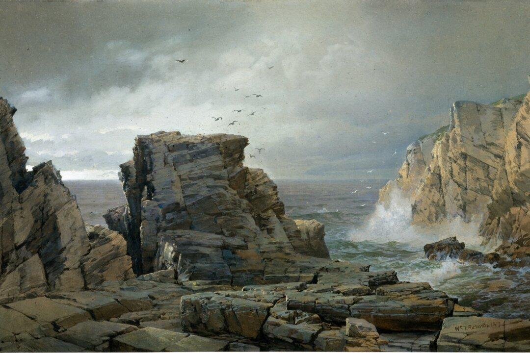
Then, in the midst of that group, I laid eyes on one that simply drew me in. It was otherworldly, and yet it was of this world. It was “A Rocky Coast” by William Trost Richards. From the first moment—like seeing the girl of your dreams across the room—I was hooked. Not only that, I thought I felt a spray of mist blow across my desk, and the salty tang of the ocean before me, reaching out from the painting, truly taking hold of my senses. I breathed in through flaring nostrils and—I was there. Now I want you to be.

How the Painting Moves Us

It is a stormy day. It could be any time in the daylight hours, for the intensity and depth of the clouds dampen the flooding daylight to verge on darkness. But the artist was a Philadelphian, and the rock formations smack of a New England coastline, so this is assuredly a sunrise.

The sky has movement, from midway up the painting on the left and then streaming diagonally to the upper right. It is shades of gray and a billowing lighter hue, only to return to a deepening darker gray. It has direction. It draws you into the picture, and then it pulls you out to sea. But this is only the backdrop for the real show—the rocks in the foreground.

I have always liked paintings with rocks. Can an artist paint a pile of boulders so they look real? Can you reach out and touch them, feel their coolness from the seawater that just broke over them, and sense how hard the formation is, compared with so much of nature that is soft and pliable? If the artist makes you believe that he has, literally, glued a miniature rock—a stone—right there into the middle of his painting, like some sort of mixed media with nature’s best-looking rocks, then he is qualified to paint almost anything else in the world. Rocks are among the toughest subjects for a painting composition.

Usually you need something else on them, or around them—flowers, luxuriant grasses, even a chipmunk in full scamper—to which the rocks are just a platform, a backdrop, the thing the observer really doesn’t see because they are busy with the pretty colors of bright blossoms, or the darting of a cute creature.

But not here, not for William Trost Richards. What he did back in 1877 was take the rocks, pure and simple, and so beautiful, with so many striations and such intricate detail, and make them the centerpiece of his painting. He didn’t need anything else to be framed by them, planted around them, or to jump on them. No, Richards takes your eyeballs and literally forces you to look directly at his rocks, in all their magnitude and richness, their hardness and wetness, and their very boldness. He painted them so they would find a place in your heart.

The center formation is just off-center, to the left. (Disaster would be found in a painting’s design if such a thing were actually centered.) Then he shifts the rocks, slightly leaning to the left, so that your head leans with them. They are the first thing you see, and that is the first reaction you have.

Picture a rollercoaster you are riding on. Can you see the tracks going up the face of the rock? It starts to descend and makes a steep, downward turn left. You feel your body rolling with the movement, leaning with the wind flowing over you, and holding on to the safety bar for dear life. Here, Richards has latched you onto the center formation, tons and tons of solid rock. They have magnetism, and their left-lean moves your eye in that direction.

You look past a gap through which you see the ocean, and then there are more rocks. But they are not as clear, not as defined, not as mesmerizing, because they are at the edge of the painting. They are a little taller than their brethren in the middle. Their role is to keep your vision in the painting and not slide off the edge, past the frame and out onto the blank museum wall. No, these rocks stop the movement of your eye, but only for a moment.

In the distance beyond this left formation is the bright spot on the horizon where the sea and the sky touch. This is the direction of the rising sun, and that illumination now grasps your attention. Then comes the upward drift of your vision to the right, through that largest open space on the canvas. Keeping your eye interested in this slow progression across the sky, there are seagulls. While they may seem to be arranged in no particular order, they are, and the artist has placed just the right number of them so they are a flock, but flying erratically over the ocean. If you cannot hear their screeches and squawks calling out in the distance, you are not listening.

Further along, the clouds go from the lighter gray to a deepening tone. The upper right of the painting does the same thing the rocks did on the left. This mass of dark sky holds on to your vision and then sends it downward. There we see more rocks, lighter ones, gray to off-yellow. There is even a point at the top of the ridge reaching up toward the darkened sky. This pulls down your vision, finally flowing to the most active section in the painting.

Not in shadow as the other formations, these rocks catch the sun’s rays, and their radiance adds vibrance to the entire scene. They have the sea marching toward them in rows of waves, crashing at their base, stirring up swirls and eddies. But the white wave has to be perfectly balanced. It cannot be too high, like a towering geyser exploding in all directions, for that would draw your attention away from the rocks, especially the centerpiece ones. The spray cannot be too small, either, for this whiteness balances out the radiance of the distant horizon on the far left. These two sunlit sections have measured amounts of brightness, as though on a seesaw with the center boulder providing a million-year-old fulcrum.

Just to keep it interesting, Richards has salted in more gulls above the crashing waves. You know they are the identical color as the darker birds. But with his variation of fool-the-eye, the center birds are dark on light, while the ones on the right, white on dark. It is the play with the sunlight, behind the center higher ones, that makes them appear dark, while the ones off to the right are illuminated by the same rays as the yellow rocks.

Detail of the birds and sea spray in “A Rocky Coast.” (Public Domain)
Detail of the birds and sea spray in “A Rocky Coast.” Public Domain
It is Richards’s mastery with colors, his understanding of light and shadow and perspective that peppers in these little touches of life that hold our attention. And don’t miss the almost imperceptible pink, all across the water’s surface, a gift of the rising sun. But beware, red sky in morning….

Taking You There

The foreground also needs to be addressed. Here is perhaps the artist’s greatest mastery of drawing his most exquisite rocks. The light from the sun shoots between the left and center boulders, glancing off the latter, so you know it is streaming through. It is evidenced by the glistening surface of these nearest table boulders. They are, in a way, welcoming, the path you would take to enter the painting and walk closer to the water. There is where you, too, will catch the first rays of the new day. You will feel and smell the spray on the sea breeze that comes in so reliably each daybreak. You could stand back and just stare at it, or you could move forward and inhale it from within the painting.

Now go back and see it all again as you take a second clockwise adventure, this time from inside the frame. The enormous center boulder is so near, not more than an arm’s length away. All around you are well-defined rocks, so rough-hewn that only nature could have made them. It took a genius to duplicate this on canvas.

Detail of the rocks in the foreground of “A Rocky Coast.” (Public Domain)
Detail of the rocks in the foreground of “A Rocky Coast.” Public Domain

Now you are in the middle of it. Be intrepid. Be bold. The rocks, the water, the wind, the reflecting sun—all together painting nature’s sweeping image. There is surging and swelling, pushing and pulling, rising and falling, cresting and ebbing. At once, there is such swirling, all the motions in nature’s repertoire. There is a momentary calm, and you take in a breath. But then there comes another crash, and a splash and the spray, and you are breathless.

I sit in my chair before the painting, on the rollercoaster, moving with the tossing and turning. I feel my chair begin to tilt and rock beneath me. It is my body moving with the rhythm of the painting.

At first, I had wondered about the title, “A Rocky Coast,” and thought the artist might have chosen better. After all, it seems so—well, plain. Anyone might look at this image and say, “Yeah, I’ve seen that on a postcard!” But you haven’t, and there is nothing quite like this so well-designed scene in nature.

A point worth making is that, unlike oil on canvas, watercolor and gouache on paper leave no room for error once the brush is dabbed onto the surface. Flub one seagull and you have to start all over, again. So, the artist had just one chance to get it right, and this for every one of the hundreds of times his brush caressed the paper.

Richards has captured the battle royal, the sea against the land, in a brutal and dynamic way. He has given his painting the motion of this never-ending collision. So, no, it is not a mere postcard photo, snapped at random, and sent to a relative in Des Moines. Rather, it is an image that he planned and designed and executed as few others could, presenting all of this enormity in a two-by-three-foot frame. His ability to do this is the miracle that is art.

Some pieces of art move me so that I am compelled to write about them—what they look like, but more often, how I see the scene in its own history. This is what the series “Taking You There” is about.
Wayne A. Barnes was an FBI agent for 29 years working counterintelligence. He had many undercover assignments, including as a member of the Black Panthers. His first spy stories were from debriefing Soviet KGB defectors. He now investigates privately in South Florida.
Wayne A. Barnes
Wayne A. Barnes
Author
Wayne A. Barnes was an FBI agent for 29 years working counterintelligence. He had many undercover assignments, including as a member of the Black Panthers. His first spy stories were from debriefing Soviet KGB defectors. He now investigates privately in South Florida.
Related Topics