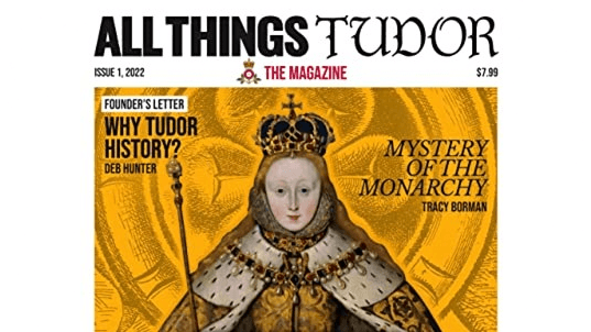
The magazine is indeed all things Tudor, with a focus on the Boleyn family. The most famous member of the family was Anne Boleyn, the second wife of King Henry VIII, who was executed relatively shortly after their marriage.
Contributing writers discuss not only Anne, but also her sister, her brother, and her father. Some of the authors’ names may be recognizable to readers, like Terence Hawkins, the British Museum, and of course the creator herself, Deb Hunter.
Articles That Aren’t (or Shouldn’t Be)
There were a few articles that I found misattributed. As I mentioned above, the final article is “more of a Q&A,” but in fact it isn’t. It is a transcript from one of the podcast’s episodes. Transcripts are typically used online for a website (like a podcast’s website or blog) or even in the content section of the podcast episode itself. The transcript seemed out of place, especially with the double introduction, the advertisement script (which I found perplexing), and the outro-conclusion with a full “thanks for listening” send off.If a transcript was a must, then some simple editing would have been appropriate. Regardless, the article should have been turned into a Q&A piece, which would have flowed more smoothly, looked better, and could still have referred to the specific episode on the podcast.
Still in the Editing Stages, but Promising
The most pronounced issue with the magazine is the lack of design between the covers. The front and back covers are fine, but what is printed within is amateurish at best. The magazine seems to be designed specifically for e-book reading, and it is obvious that the lion’s share of editing was done solely for that. There are still link lines under words and phrases, full urls, and other editing faux pas. There are no columns on the pages, just lines that stretch left to right. Images are haphazardly placed and often take up far too much room, which lengthens the number of pages in the magazine.At the end of several of the articles, there is a sources cited section. This is an oddity for a magazine. If sources must be cited within the magazine, it would be preferable to have them at the very back of the magazine, categorized according to articles and numbers.
Hunter has a successful podcast and it is very professionally produced (I’ve listened). Also, one does not host the guests she has without being reputable. For the magazine, the writers are fine and so are the topics (though the book review issue should be sorted). What is missing is both a capable editor and a print designer (even one with minimal experience), specifically the latter.
Hunter has a good thing going with the podcast, but the magazine should be revisited. Most new projects start off less than perfect. The magazine is only three issues in. That’s definitely early enough to make changes needed to keep readers engaged and the professionalism on par with the podcast.