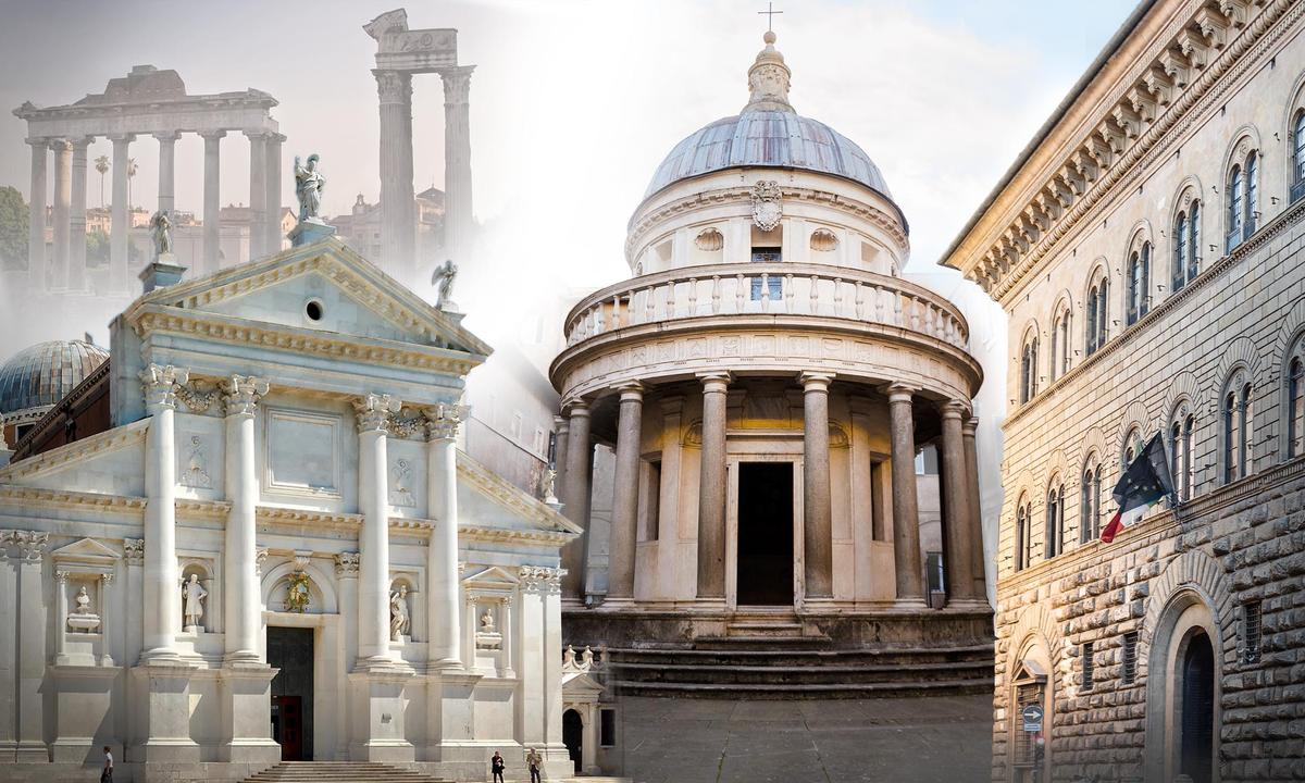
The artists of the Dark Ages were neither blind nor indifferent to the perfection and transcendent beauty of classical ancient Rome that lay half-buried strewn in their midst.
Medieval artists didn’t know they were “medieval” relative to those ruins, yet the humanists who subsequently began fostering a classical revival knew full well they were different. No previous Western art movement became so self-conscious. What started as a myth of ancient revival began unfolding in real time before their eyes. It became clear: civilization was entering a Renaissance.
Expressing this insight, 14th-century poet Petrarch wrote: “When the darkness breaks, the generations to come may contrive to find their way back to the clear splendor of the ancient past.”
With the rediscovery of ancient architecture and literature came the revival of ancient values which, in many ways, seemed out of place in Christendom. Roman understandings of natural laws and divine order contrasted accepted conceptions of a supernatural holiness. Yet men of the day deemed it self-evident that both were correct; fusing these two worlds would mark one of the great challenges of the Renaissance.
Architecture saw a convergence where these two worlds would, in fact, join harmoniously and forever reshape Western aesthetics—everything from our civic buildings to the temples where we worship. And Florence was where much of this began, where geniuses of the day made this manifest.
Unlike northern Europe, where Gothic chiefs might have risen to nobility by overthrowing Roman rulers, the mercantile republic of Florence descended from Rome herself and supported individual freedom. In Florence, the civic and mundane trumped the aristocratic and clerical. The foregoing Gothic values of nobility and chivalry confronted a humanistic value system that venerated the prowess of the individual and intellect as supreme.
Florence was also where a major breakthrough occurred in the visual arts.
Brunelleschi extrapolated linear perspective by conceiving a two-dimensional picture as corresponding to reality observed through a window. Thus, a two-dimensional world must obey visual laws that could be studied and perfected. Seeing how lines traveling at right angles from a window converge at a point on the horizon on a two-dimensional surface, artists were able to reconstruct an illusionistic three-dimensional space.
I. Porta del Paradiso (The Gates of Paradise)
In 1401, the baptistry in Florence sought a design for a second set of 17-foot-high, gilded bronze doors, after the first was completed by Andrea Pisano, and chose to outsource the work via a competition for the best plan. Ultimately, it was Lorenzo Ghiberti who won with his relief. Doing away with Gothic gracefulness, he pursued a robust naturalism and greater depth, illusionistic and actual, in a series of narratives. He displayed his mastery of perspective in these doors, completed in 1424, which were eventually mounted on the north side of the baptistry.So celebrated was Ghiberti’s work that he was immediately commissioned to produce a third set. He had already surpassed Pisano and would now strive to surpass himself. Depicting fewer narratives this time, he used Old Testament subjects to depict naturalistic details—anatomy, drapery, and landscapes—to fully demonstrate his skill as a draftsman.
All of the scenes were made to the same scale so that the foreground figures were all the same size. He capitalized on every opportunity to generate illusionistic depth using linear perspective modeling various structures, be they rectangular, circular, arched, or rustic. “I strove to imitate nature as clearly as I could and with all the perspective I could produce to have excellent compositions with many figures,” Ghiberti wrote.
II. Palazzo Medici Riccardi
Built for Florence’s first citizen beginning in 1444, the three-storied Palazzo Medici Riccardi set the architectural tone for the entire city. Exuding stoic order, the building achieves its visual impact through the subtle variation of its exterior texture with large blocks across the lower level, the middle level displaying smooth rustication, and a flat wall surface above. Simple rectangular and arched windows and portals repeat all along the sides while a massive, wide cornice overshadows the whole.Palazzo Medici’s sober exterior carries over into its interior though with little more elegance. Its inner courtyard is encircled by a simple, square colonnade supporting arches with circular reliefs. All is tightly integrated and controlled.
A wealthy banker who took his civic duty seriously, Cosimo de' Medici, owner of the mansion, chose a design that would convey ample, solid wealth as opposed to the prevailing Gothic extravagance displayed in other rich houses.
III. Tempietto
One of the chief challenges Renaissance architects faced was that of how to reconcile classical architecture—which they theorized on and systematized into a language during the Renaissance—and the very un-classical, irregular Christian basilica of medieval times.Masters such as Alberti and Leonardo da Vinci conceived the circle as the most natural geometric form, one that was shown to repeat in the human body in da Vinci’s “Vitruvian Man.” A hemispherical dome, such as the one in the Pantheon in Rome, would complete a symbolic representation of the cosmos.
In this quest to integrate Christian and classical, Donato Bramante around 1510 made a resounding breakthrough with his martyria, the Tempietto. Honoring St. Peter, it was erected in Rome at the location where the saint was believed to have been crucified. It incorporates a circle in an innovative, centrally planned concept that had far-reaching influence.
This relatively small monument would later echo resoundingly in the gargantuan St. Peter’s Basilica, and even centuries later in the Capitol Building in the U.S.
The Tempietto was considered a radical divergence from Bramante’s contemporaries, yet was hailed for achieving classical purity. Bramante did away with all decorum to restore the true Doric order—one of three systems of classical architecture—as the ancients intended. He devised a circular colonnade bearing the more ancient flat entablature instead of arches. It was considered the first correct usage of that order during the Renaissance. A hemispherical dome crowned the monument, completing what had been haunting Renaissance architects until then.
The site was not completed, however, as the martyria was not intended to remain in isolation but was to be the nucleus within a circular external colonnade of 16 columns to match those in the center. Together, they would have comprised an ordered environment where voids, masses, and volumes coexist in perfect equipoise.
Yet, Bramante’s achievement hardly went unnoticed. In 1506, then Pope Julius II initiated renovations on the “very dilapidated Church of St. Peter the Apostle in Rome from its foundations up.” Bramante submitted a design based on his centrally planned concept and it was accepted.
IV. St. Peter’s Basilica
Neither the plans for St. Peter’s that Bramante had drafted nor the construction itself saw any further progress for 40 more years due to a lack of funding—despite the Church’s selling of indulgences which sparked Martin Luther’s subsequent protests.When construction restarted, it was none other than Michelangelo who was appointed to head up the project in 1546. Work would continue up until his death 18 years later and afterward, with much still unfinished.
Michelangelo reworked Bramante’s design—and indeed his own, constantly—making it bolder and more integrated, arranging a continuous flowing space surrounding the four great piers supporting the colossal drum and dome.
Michelangelo’s centrally planned design would later be transformed into a Latin cross by Carlo Maderno, who succeeded him, yet St. Peter’s owes more to Michelangelo than any other architect. Retained in the basilica are his exterior patterns repeating around the transepts, apses, and on both sides of the nave, articulating the enormous mass of masonry with supreme dignity and rhythm.
That exterior consists of giant Corinthian pilasters backed by vertical strips, casting deep shadows. With soaring verticality reminiscent of Gothic tradition, their insistent upward thrust is interrupted by a horizontal cornice and attic, over which the hemispherical ribbed dome appears to float.
Michelangelo’s logical distinction between structure and decorum facilitated unbridled expression and freedom within orderly bounds in St. Peter’s. Moreover, with the seamless merger of Bramante’s centrally planned temple and the medieval basilica, the goal was realized; they had revived the “splendor of the ancient past” with the Christian forms of the present.
Yet, a problem lingered—one that had long vexed Renaissance architects, preventing them from fully achieving the classical conversion: Their aims of applying the orderly classical syntax were frustrated by the medieval basilica’s chaotic and irregular façade.
V. San Giorgio Maggiore
Ultimately, it was not a Florentine architect who would resolve this, but one from another highly independent republic—the mercantile oligarchy of Venice. After the library of San Marco introduced the Renaissance to Venice in 1537, it found an admirer in Andrea Palladio, who would go on to promulgate his own treaties on architecture based on the classical orders.Like his predecessors, Palladio sought to match classical forms with the irregular Christian church façade. The latter consisted of a vertical nave joined by lower side aisles jutting horizontally to either side. Thus, it was typically split into two levels with the lower one spanning breadthwise and the upper corresponding centrally to the nave.
Begun in 1565, the church of San Giorgio Maggiore in Venice ultimately saw the matter resolved thanks to a conception by Palladio. He confronted the disparate levels of the basilica by introducing not one but two distinct classical temple fronts interlocking together in a single façade.
One front would span the basilica’s lower, horizontal level, while the other would match its central, more vertical nave, topped by a pediment. The triangles jutting out from either side of the nave in his design represent conceptual ends of the lower pediment, whose base forms a stringcourse spanning the entire width, interrupted by four half-pillars.
Pilasters set on low bases span the building widthwise, while the half-pillars supporting the narrower front are set on high pedestals, lending an “un-classical” verticality to the design. These orders are repeated in the interior, in the same way, thus uniting the whole.
Palladio’s solution harmonized the conflicting Christian and classical buildings—thus closing another chapter in the quest to revive ancient wisdom.