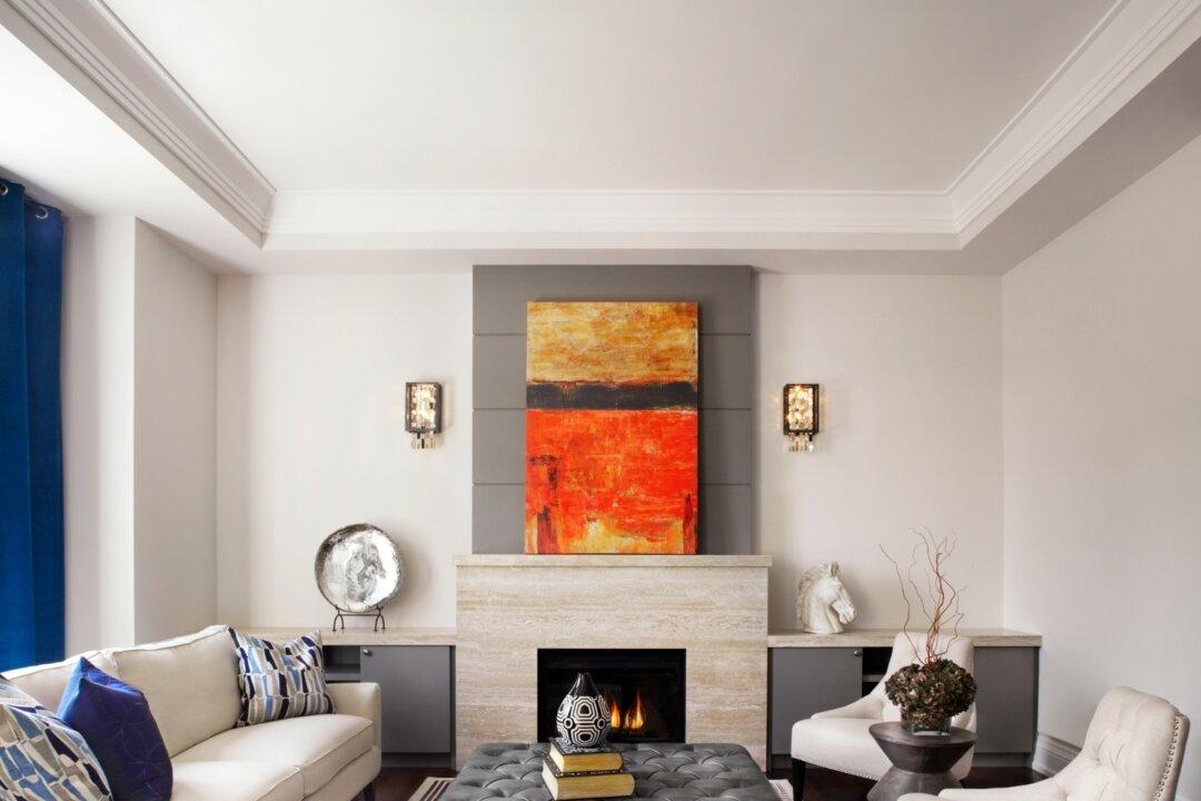
Tobi Fairley remodelled her two-storey, 2,500 sq. ft. home with a desire to create a gracious living space for her husband and daughter. She also wanted well-groomed rooms to entertain in, especially during the holidays.
“The first thing I do is select the upholstery and the one fabric pattern in a room that will be dominant. It could be a fabric with the boldest or the biggest pattern,” Tobi said.
For a pattern palette that works, Tobi advises using varying scales of patterns “or they will fight each other.” She chooses the floor coverings last.
“It should definitely coordinate with the colours and patterns in the room, but it should be more subtle. You don’t want to constantly draw the eye down to the floor,” she said.
Tobi’s entry hall gives visitors an exuberant welcome. On the right hand side is a gracious staircase. Its wood detailing is outfitted in crisp white paint that frames the oversized white and black toile wallpaper.
“I added the moulding under each riser to give it some architectural interest,” Tobi said. She and her husband chose the 1970s-era home because it was “built with care and a lot of detail.”
“When I design a home, I like to have the rooms flow well and a good colour story is one way to do that,” she said.
In these rooms, green is a fresh, vibrant accent colour. “The inspiration for the living room was the gorgeous green wing chairs,” Tobi explains.
The living room, on the entry hall’s left side, blends traditional with contemporary design. The chairs are traditional with a twist. Their “brocade” is graphic and stylized. Visually framing the chairs and Christmas tree is a window treatment of drapery and white plantation shutters.
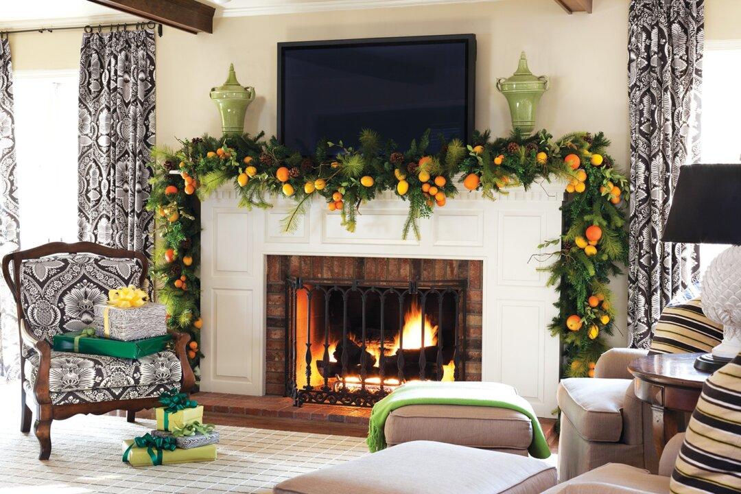
The tree’s vibrant ornaments also appear in the family room and on the staircase. Pattern repetition creates unity in a home’s design—including gifts under the tree. The key to working with bold design statements is keeping accessories to a minimum. Tobi’s colour motifs, patterns, and bold graphics are restated in the fabric in the window drapery, chairs, and accessories. This gives the rooms a cohesive narrative. Attention to detail brings all the design elements in a room together.
Leading from the entry hall is the family room where a handsome wood-panelled area draws family and friends together. Neutral walls, flooring, and upholstered furniture act as a foundation for the room’s patterns. The toile fabric in the chair and draperies reiterates designs found in the living room and staircase.
“When decorating a mantel for the holidays, I love to remove everything that is not part of the holiday theme, and then give the mantel a lush and full look,” Tobi said.
“I love how the design looks—fresh and colourful.”
Canadian Home Trends Magazine gives you a personal tour of the most stunning homes and condos. In each issue, you are given the tools to recreate designer spaces you’ve always dreamt of having at home, in-depth renovation and design advice, and the best places to shop. To subscribe, visit www.CanadianHomeTrends.com
