Interior designer/builder Isabelle Boba knew her just-purchased home in Toronto had good bones, but perhaps a few too many. “There were just too many walls to even count,” Boba remembers. With help from husband Mariusz, a mechanical engineer, Boba created a home so welcoming, “friends invite themselves over.”
A painting of a peacock inspired the dining room’s majestic blue wall colour. Located just to the right of the foyer, it offers a relaxing gathering place for friends and family. “I wanted a room that wasn’t too formal,” Boba said.
The linen fabric on the tufted Parsons’ chairs is elegant and durable. Fashioned from salvaged sustainable wood, the dining table is rustic-refined. The chandelier’s soft blue shimmers accentuate the room’s convivial vivacity. Gold, a theme throughout the home, is deftly illustrated in the accessories.
Leading from the foyer, the oak wood floor found throughout the home gracefully draws visitors to the kitchen. An opulent vignette of a demi-lune maple table is complemented by wafting feathers in a shadow box. A sculpted dish restates the arc of the feathers, table, and the wallpaper’s light gold mesh. For the artwork, Mariusz asked Boba to ensure “it had meaning.” Both the feathers and the peacock are symbols of love, Boba notes.
A study in understated cool whites and marble, the kitchen faces the vignette. “I couldn’t live in a home again without an island. It’s the centre of the house,” Boba said.
The herringboned backsplash uses Bianco Carrara marble, as does the island. There’s a grand view of the breakfast area, living room, and backyard from the kitchen. White moulding brings bright light and height to these rooms.
The breakfast table paraphrases the dining room’s theme of a dark wood table, linen-covered chairs, and gold. The gleam of the chairs’ “jewellery” is replicated in the chandelier and gilt bowl.
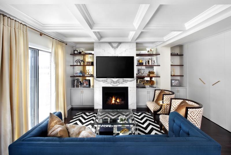
In the living room, the peacock-coloured couch provides a glamourous roost while adding a bold boost to the room’s patterns. With a nod to Art Deco patterns, the wood-bordered tub chairs combine the room’s leading colours of gold and white. The tables seemingly defy gravity with their slim outlines and provide function while reproducing light.
“When mixing patterns, make sure the pattern is different in size and proportion. It’s the successful way to do layers,” Boba advises.
Boba wanted a “calm” space for the master bedroom. Reflective surfaces introduce light. Gold in the draperies and lamps highlight the room’s softly spoken elegance. Lamps with large shades and an “open base” complement the room’s proportions without being heavy, Boba said.
The ensuite sparkles with glass and marble whereas the guest bathroom is dressed in vintage colours and fixtures. The Bobas’ love of travel is seen in their powder room. “I wanted to be taken to another world—the room is inspired by the Hôtel Costes in Paris. I wanted an enchanted feel,” Boba said.
As for the overall finished product: “Friends and family love it—people sense it when it intrinsically feels good. My husband is really happy with it,” Boba enthuses.
“I’m glad it’s done. It was hard work, but a fun process. It felt a little like Christmas when it was done.”
Space Designed by Isabelle Boba, Founder and Managing Principal of LUX Design, www.luxdesign.ca;
Canadian Home Trends Magazine gives you a personal tour of the most stunning homes and condos. In each issue, you are given the tools to recreate designer spaces you’ve always dreamt of having at home, in-depth renovation and design advice, and the best places to shop. To subscribe, visit www.CanadianHomeTrends.com
