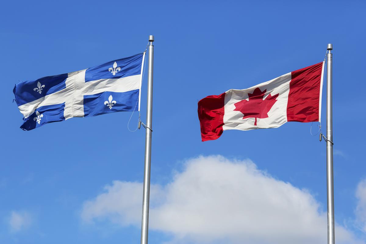
Quebec separatism might not be on full throttle these days, but there’s definitely a “different-from-the-rest-of-Canada” spirit to how federal candidates are promoting themselves in La Belle Province via their campaign signs.
Elsewhere in the country, campaign posters and signs tend to be generic: the colour of the party, candidate name, party logo, and riding name—pretty cookie-cutter. Quebec’s signs, however, are rich in visuals, with candidates’ faces and illustrations. It probably has a good explanation.
By way of example, powerful branding contrasts are evident between Grit and Tory signs, with layered messaging (if you know what to look for).
One difference is in what the candidates are wearing. Liberals, with light-coloured button-downs, signal a casual “have a lemonade with me on a summer day” feel. Montreal incumbent Anthony Housefather, for example, wears a light-hue pink, no doubt carefully curated to give off the modern “metro” vibe to appeal to youth and female voters.
On the flipside, Conservatives are decked in professional attire: dark blouses for the women and dark suits and ties for the men. It’s selling the more serious approach; that is, no bhangra dancing, no bananas stuffed down the pants, no Chewbacca socks, no hugging puppet unicorns, no “drink box water bottle things,” no shirtless selfies. It’s saying “we mean business” (in both the “talk turkey” sense of the word and bringing business to Canada sense of the word).
On the Liberals’ signs, in contrast, to the right of the candidate’s image is a collage of faded faces of varying colours, ages, and genders, as if to imply that they’re the party of the multi-culti “everyman” (or “peoplekind,” whichever you choose). It’s a something-for-everyone unity-and-love message versus the niche patriotism message. It’s peculiar, though, as one might have thought it would be the Liberals who’d place emphasis on Quebec, since they likely need it to hold onto power.
What also stands out is how prominent—or hidden—the party name is on the signs. The Liberal name is unabashed, big and bold at the top right-hand corner, seen from 18 feet away, right next to the candidate’s image. But on the Tories’ signs, the word “Conservative” is the equivalent to a footnote at the bottom, in puny font. Passersby have to squint to see it. It’s kind of a “by the way, we know you’d never consider voting for this party, but maybe there’s an off-chance we could convince you if the picture looked like a bus ad from a realtor, lawyer, or insurance salesman.”
Because image is paramount for the Trudeau Liberals, especially in Quebec, each election requires a complete sign makeover. “A fresh look, for a fresh outlook” might as well be the slogan, like a cliché cosmetics television ad. Take the example of Marc Garneau, a Liberal candidate in the Montreal area. In 2019, his clothing was dark, versus 2021’s light colours. In 2019, he wasn’t wearing glasses, but in 2021, specs play better.
In 2019, on the left-hand side of the Liberals’ signs there were pictograms symbolizing things like economy, jobs, and housing, whereas in 2021, issues were too much for constituents to think about, apparently. The marketing team must have realized no one’s expecting much from Trudeau’s “zero calorie” policies anyway. A simple face and a name was all voters needed to know.
This is as much true with Justin Trudeau’s recent election signs, featuring him in an off-white button-down and dark-blue tie (wrong team colour, but marketing said it suggests he has “range.”) Suit jackets, apparently, are an unnecessary accessory—too stuffy!—relegated only for Parliament, solemn events, and meeting other dignitaries.
In everything from tone and image to messaging and branding, Quebec’s campaign signs and posters are so unlike those in the other provinces that it is indeed as though they’re from another country.