Commentary
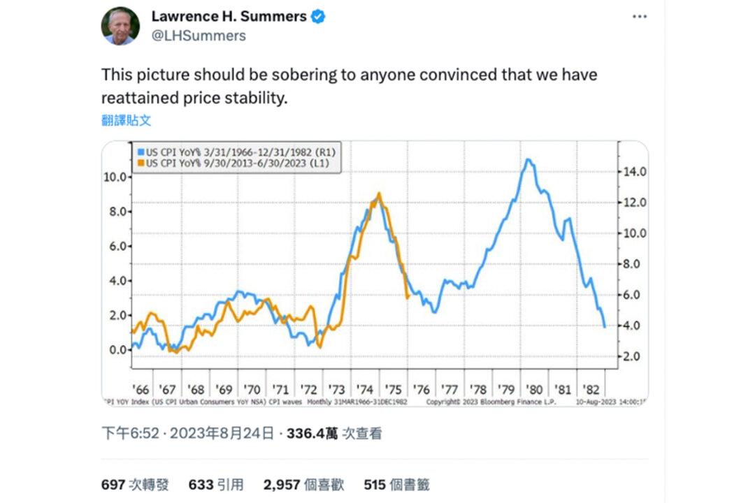
Three weeks ago, Lawrence Summers posted in his X (formerly Twitter), a chart comparing U.S. CPI YoY inflation with the mid-1970s. The chart attracted many views as well as lots of criticism. Quite a portion of the negative comments were from academics.


