Just How Important Is Color When Making Online Content?

Just How Important Is Color When Making Online Content?
InspiredImages/Pixabay
Updated:

Color is something we all experience every day. We notice its beauty in everything from flowers to art. It sets the mood in our most commonly trafficked rooms and offices. It even dictates our behavior in many cases—especially in applications like traffic lights.

Depending on who you talk to, you might hear that color psychology is one of the most important considerations in the world of web design and digital marketing. Or you might hear that colors don’t really matter—and that people selling you on the former idea are exaggerating the effects of color.
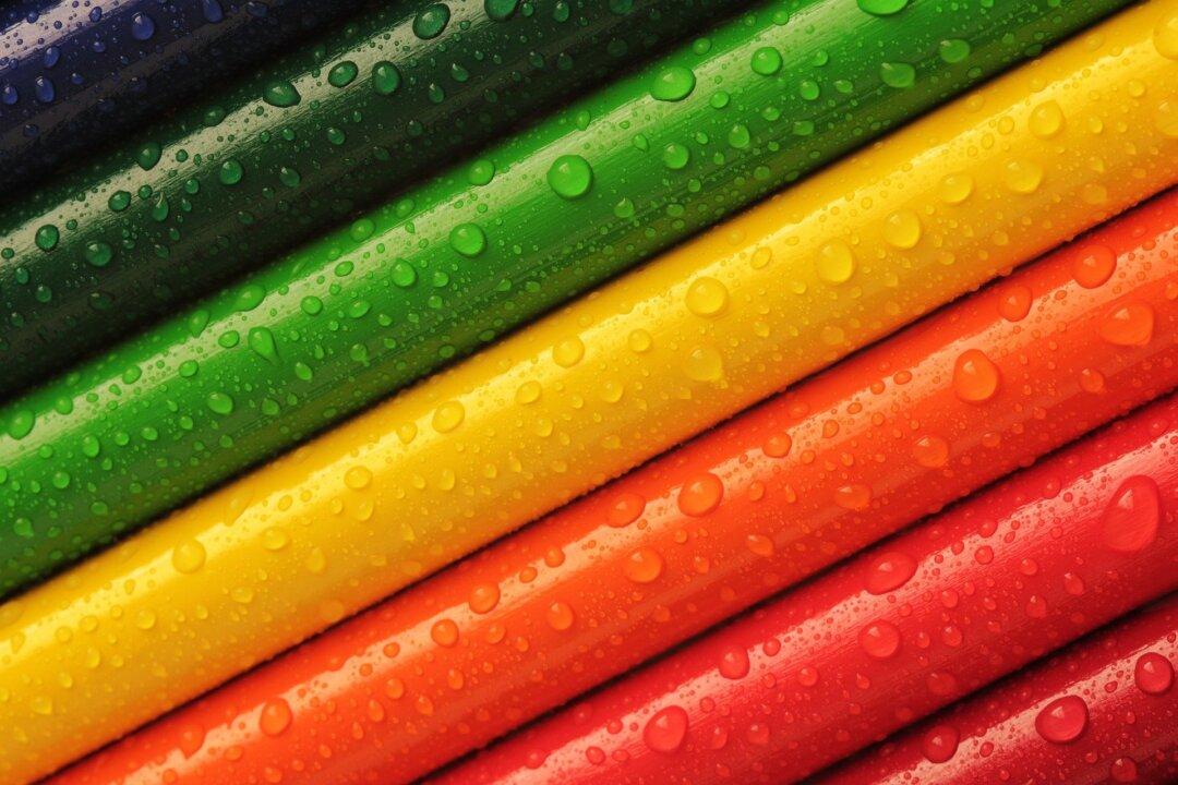
So just how much of an impact does color have when designing a website and creating online content for your brand? It’s a complicated question, but we’ll try to answer it.

The Legitimacy of Color Psychology

One of the most important concepts to explore in answering this question is the legitimacy of color psychology. In other words, is it true that certain colors trigger changes in human mood, thinking, and behavior?

The short answer is yes, colors can and do have an impact on human behavior. This has been clearly demonstrated in a number of different studies. For example, color is one of the most important tools human beings have for determining the edibility of food, at least from a biological standpoint. Bread tends to sell better if it’s wrapped in packaging that makes it appear more of a golden brown—making it appear fresher or better-cooked. People also tend to describe and rate the flavor of certain foods differently based on how it’s colored; for example, a cherry-flavored green drink might be described as “lime” by a disproportionate amount of participants.

Coral Champagne cherries are dark and ready to be picked at Nunn Better Farms in Brentwood, Calif., on May 20, 2021. (Ilene Eng/The Epoch Times)
Coral Champagne cherries are dark and ready to be picked at Nunn Better Farms in Brentwood, Calif., on May 20, 2021. Ilene Eng/The Epoch Times

When it comes to how colors affect mood and human decision-making, however, the science is much more complex. While it’s commonly stated that blue is associated with calmness and red is associated with excitement, it’s not clear just how profound or typical these effects are, or whether social culture is responsible for their effects. If we claim that “blue is calming” for a long enough period of time, we may genuinely see a change in how the general public views the color blue just because of popular perception.

This idea is strengthened by the fact that different cultures tend to see colors in different ways. Much of this boils down to how we describe color in language, and the words we use to describe different colors. Different cultures have different selections of words to describe the same spectrum of colors, resulting in different perceptions related to shades and associations of colors.

In studies that pursue this phenomenon, a simple principle emerges. When people describe colors as having positive qualities, such as “clean” or “calming,” and/or when they subjectively like those colors, they become far more likely to engage with things that feature those colors—for example, if you like the color blue, you’ll be more likely to buy a blue product at the store (or, more related to the topic at hand, click a blue button).

So what does this all mean for our discussion of color psychology in the digital marketing world?

Basically, while it’s clear that color can have a measurable influence on human thought processes, feelings, and actions, the science isn’t definitive. Color influences are a result of both biological and socio-cultural factors, and perceptions of any single color will likely vary between people of different backgrounds.

Branding and Consistency

There is one area of digital marketing where color choice is profoundly important, at least to an extent: branding. Your company’s brand serves a number of important purposes. It’s designed to characterize and concisely define your brand. It’s supposed to become more familiar and recognizable over time. And it’s responsible for forming people’s first impressions of your company at the same time.

Because of this, choosing the colors associated with your company is one of the most important marketing decisions you’re going to face. Do you want colors that your target audience is likely to find calming and comfortable? Or colors that motivate and energize them? Do you want strongly contrasting colors that create a loud and unique combination or a set of colors that almost blend together?

There are no right or wrong answers here, but you’ll need to understand how your target audience feels about various colors, the key characteristics you want associated with your brand, and other factors before you can make a final decision.

Once you settle on the colors you want most closely associated with your brand, you can work to include them more throughout your website, your landing pages, and even your other marketing materials. While these strongly branded colors may not make much of an impact on consumer behavior in the earliest stages of your company’s development, as you continue to grow, they’ll serve to give people a much more consistent and familiar experience. As people grow more accustomed to these colors, they’ll become much more persuadable by your messaging.

The Role of Contrast

Some studies suggest that people are inherently more likely to engage with a landing page (or convert) if the call-to-action (CTA) is a specific color (e.g., red is more likely to convert than green). But other studies have cast doubt on these assertions, finding that the exact color had almost no statistical impact on conversion rates.
A photo of balloons in the sky (Pixabay)
A photo of balloons in the sky Pixabay

However, there’s one important principle that seems clear: strongly contrasting colors tend to influence engagement. This concept should be intuitive. If there’s a light green button on a slightly darker green background, you may not notice the button at all—and if you do, you might not think it’s very important. But if there’s a red button on a green background, regardless of shade, the strong contrast will naturally draw your eyes—and possibly motivate you to take action.

Because of this, it’s important for marketers to include contrasting colors whenever you want to guide your users’ attention.

Key Takeaways

If you’re interested in using colors properly in your web design and marketing, these are the most important takeaways to review:
  • Color psychology matters, but is not set in stone. There’s no doubt that color can impact human behavior—but it’s not as one-to-one as you might think. Green, for example, doesn’t have a universal and easily predictable set of effects on people.
  • Cultural and individual differences have a major impact on perception. If you grew up in a world where there is no word for “green” and blue is associated with “stop” instead of red, you might walk away with a totally different relationship to color than someone from the United States. You need to understand your audience to use colors well.
  • Branding is the most important application of color in marketing. Color is used in almost all your visually dependent applications, but your company’s branding may be the most important, since it sets the stage for all your marketing and advertising to come.
  • Contrast encourages people to act. Specific colors may not give you a higher conversion rate, but strongly contrasting colors will. Use sharp differences to draw people’s attention and get them to take specific actions.
  • Experimentation is vital for success. Theory is often different from practice. Whatever you hypothesize about how colors will influence your audience’s behavior, you’ll need to test it in a live environment to make sure it works. Try out a variety of different colors in a variety of applications before you make any definitive conclusions, and make sure you challenge your assumptions. Only through your own tests can you say for sure how a color works for your audience.
While the debate about color effects will continue to rage indefinitely in the psychology community, in the marketing community, we have some clear answers and clear direction. Use these concepts to win more users and see better results in your marketing strategies.
By Nate Nead
ReadWrite
ReadWrite
Author
ReadWrite aggregates professional communities dedicated to specific subjects of interest such as connected cars, smart homes, AR/VR, fintech, and APIs. https://readwrite.com/
Related Topics