Goodbye, Twitter. Hello, X.
Elon Musk has unveiled a new “X” logo to replace Twitter’s famous blue bird as he follows through with a major rebranding of the social media platform he bought for $44 billion last year.
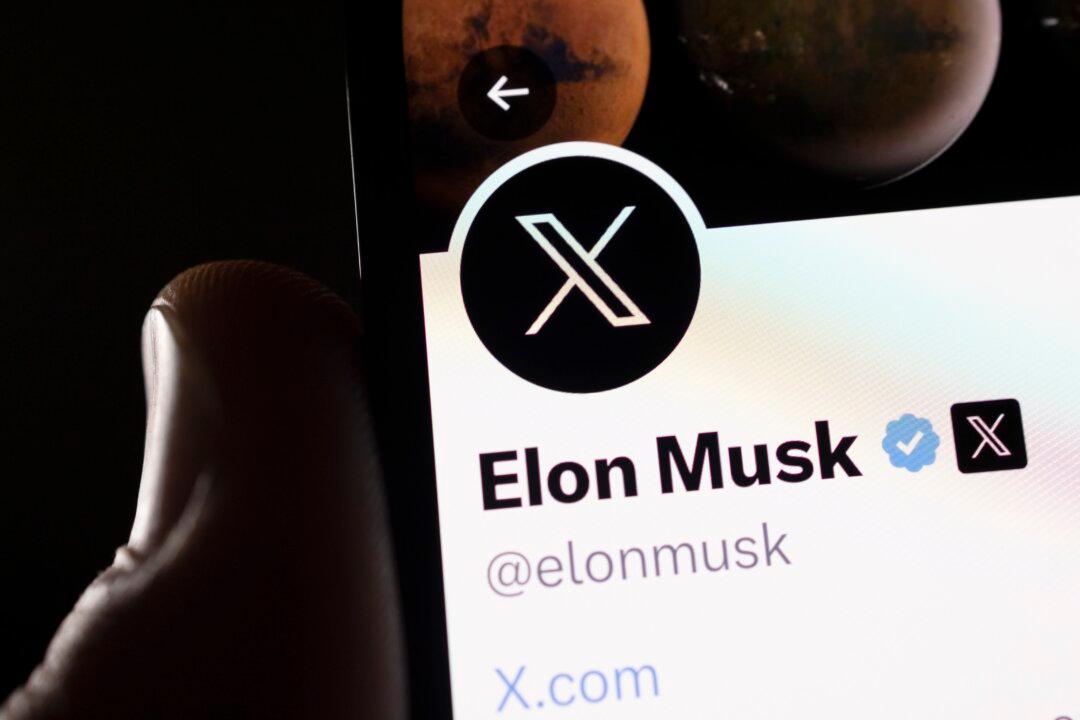
The X started appearing at the top of the desktop version of Twitter on Monday, but the bird was still dominant across the smartphone app. At Twitter’s headquarters in San Francisco, meanwhile, workers were seen removing the iconic bird and logo Monday until police showed up and stopped them because they didn’t have the proper permits and didn’t tape off the sidewalk to keep pedestrians safe if anything fell.
As of early afternoon, the “er” at the end of Twitter remained visible.
Mr. Musk had asked fans for logo ideas and chose one, which he described as minimalist Art Deco, saying it “certainly will be refined.” He replaced his own Twitter icon with a white X on a black background and posted a picture of the design projected on Twitter’s San Francisco headquarters.
“And soon we shall bid adieu to the twitter brand and, gradually, all the birds,” Mr. Musk wrote on Twitter Sunday.
The X.com web domain now redirects users to Twitter.com, Mr. Musk said.
Mr. Musk, CEO of Tesla, has long been fascinated with the letter X and had already renamed Twitter’s corporate name to X Corp. after he bought it in October. In response to questions about what tweets would be called when the rebranding is done, Musk said they would be called Xs.
The billionaire is also CEO of rocket company Space Exploration Technologies Corp., commonly known as SpaceX. And he started an artificial intelligence company this month called xAI to compete with ChatGPT. In 1999, he founded a startup called X.com, an online financial services company now known as PayPal.
Additionally, he calls one of his sons, whose mother is singer Grimes, “X.” The child’s actual name is a collection of letters and symbols.
Mr. Musk’s Twitter purchase and rebranding are part of his strategy to create what he’s dubbed an “ everything app ” similar to China’s WeChat, which combines video chats, messaging, streaming, and payments. Mr. Musk has made a number of drastic changes since taking over Twitter, including a shift to focusing on paid subscriptions.
Linda Yaccarino, the longtime NBC Universal executive Musk tapped to be Twitter CEO in May, posted the new logo and weighed in on the change, writing on Twitter that X would be “the future state of unlimited interactivity—centered in audio, video, messaging, payments/banking—creating a global marketplace for ideas, goods, services, and opportunities.”
But ad industry analysts were less certain about X’s prospects.
“Musk supporters will likely celebrate the rebrand, but it’s a gloomy day for many Twitter users and advertisers,” said Jasmine Enberg, an analyst with Insider Intelligence. “Twitter’s corporate brand is already heavily intertwined with Musk’s personal brand, with or without the name X, and much of Twitter’s established brand equity has already been lost among users and advertisers.”
Whether advertisers will ever return depends on how successful the rebranding is and whether Mr. Musk is able to accomplish his goal of creating an “everything app.” That remains to be seen, said ad expert Mark DiMassimo.
“Advertisers care about what they’re buying. So if his strategies work, I don’t think advertisers could care less about what he calls it,” Mr. DiMassimo said.
“I think changing the name is just a way for him to say, ‘Stop having Twitter expectations, this is a new thing, judge it as a new thing,’” he added. “And you know, that only works if the new thing works.”
Twitter users also pointed out that few people refer to Alphabet, Google’s parent company since 2015. Facebook renamed itself Meta in 2021, but its collection of apps—Instagram, WhatsApp, and Facebook—still retain their own brands and logos.
Twitter’s recognizable blue bird logo went live more than a decade ago in 2012, replacing an earlier bird logo ahead of the company’s Wall Street debut as a publicly traded company.
“I’m sad to see it go. It had a great run,” said the logo’s designer, Martin Grasser. “But 11 years, 12 years is really long for a corporate identity to stick around. It feels like the platform is changing and they have a new direction and it makes sense” that they would pick a new logo to signal those changes.