The National Renewable Energy Laboratory this week said that rooftop solar panels have the potential to generate nearly 40 percent of electricity in the U.S. But what about the cost of going solar?
Many people ask when the cost of producing power from solar photovoltaic (PV) panels will be equal to or less than buying from the grid—a point called “grid parity” that could accelerate solar adoption.
But in asking the question, they often compare apples to oranges and forget that the answer varies from place to place and from one type of installation to another.
For example, electricity from utility-scale solar systems (typically large arrays where panels slowly change tilt and orientation to face the sun all day) usually costs less than electricity produced from solar panels fixed on someone’s home. Also, residential electric rates, on average about 12 cents per kilowatt-hour in in the United States, are much higher than wholesale electric rates—the price utilities pay to power generators—which are usually less than 4 cents per kilowatt-hour.
At the same time, different states have more or less sun—solar power in Florida is typically more economic than in Alaska, for instance. All of these factors make the question more complicated than people might anticipate.
How, then, can we compare the cost of rooftop solar to the cost of buying power from the local electricity grid and thereby find when which states will hit the point of grid parity?
Putting a Number on Solar Cost
The levelized, or average, cost of electricity from a solar PV array is derived from all the money spent to buy, install, finance and maintain the system divided by the total amount of electricity that system is expected to produce over its lifetime. We call this value the Levelized Cost of Electricity (LCOE) and it’s expressed in terms of dollars per kilowatt-hour ($/kWh). The same metric can be used to determine the cost for a coal or natural gas plant. Planners like it because it reduces the cost of a power plant over a span of many decades into a single number.
Despite the strengths of LCOE as a metric—it is easy to understand and widely used—it has some shortcomings, too. Namely, it leaves out geographic variability, changes with seasons and usually ignores the cost of environmental impacts such as the cost of carbon emissions. This metric is a bit too simple when comparing variable wind and solar generators to power plants that you can turn on and off at will, such as those fueled by uranium, coal and natural gas.
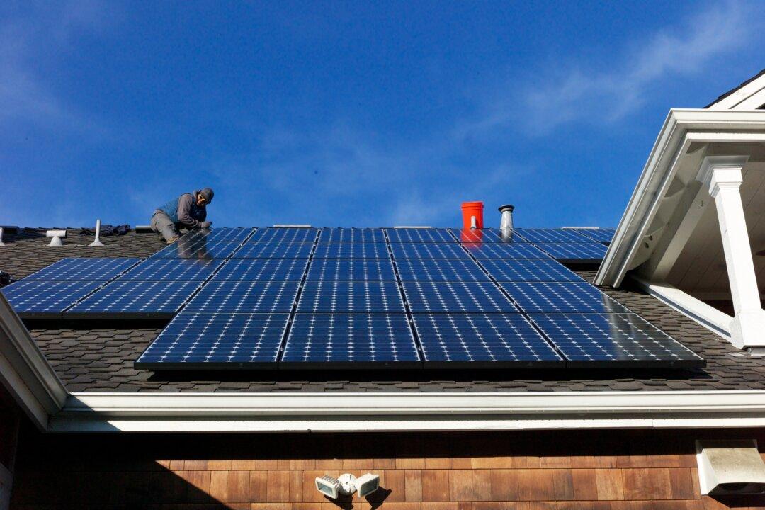
Today the average cost of energy from solar PV in the United States is reported to be 12.2 cents per kWh, which is about the same as the average retail rate.
Those who keep close tabs on electricity prices might think that it is about on par with what they are paying for their own electricity at home. This number can be misleading, however, because it represents the average price of utility-scale solar across the United States, not necessarily the cost borne to produce electricity from solar panels on our homes.
So how do we know how close residential solar is to grid parity where you live? Ultimately, that depends on two things: how much you pay for the electricity you buy from the local grid, and how much can you get paid for the electricity you can produce from PV. Let’s take a look at both of them.
How Much Sun Do You Get?
The Energy Information Agency (EIA) has created a map of average electricity rates by zip code, averaged to the county level and remade by the author in the map below. The deep red (or darker) colors indicate higher average residential electricity rates.
Electric rates vary a great deal across the country, and these differences could be caused by a number of economic, historical or regulatory reasons. Likewise, the costs of solar and the availability of the solar resource (i.e., how often and how strong the sun shines) also are not homogeneous throughout the United States. The figure below shows the LCOE of residential solar across all counties nationwide.
The data on the residential solar costs were pulled together from an ongoing large-scale campus-wide research project at the Energy Institute at The University of Texas at Austin. The main assumptions behind the data are a total cost of $3.50/Watt for the solar PV installation for a fixed array pointing south with a tilt of 25 degrees. Solar production data are based on a 2013 National Renewable Energy Laboratory study.
That southern orientation and tilt represent a rule of thumb and might not be the optimal solar placement in every locale.
The U.S. Department of Energy SunShot Initiative has a stated goal of lowering residential solar PV system installations to $1.50/Watt. Cheap PV panels from China have driven down the hardware costs to the point where the price of a total PV system is now dominated by “soft costs”—namely, customer acquisition, installation, supply chain, permit, etc. Still, total installed system costs continue to fall.
While those cost cuts are impressive, the major driver in the cost of energy produced is the amount of solar radiation that strikes the solar panels. Obviously, some locations are sunnier than others so a solar array in Arizona will produce more energy than one in Washington state, making the system more economic for the homeowner.
And, the prevailing cost of electricity varies nationwide. Some of the areas with the lowest cost of grid power (e.g., Washington) have some of the highest solar costs because of low levels of sunshine. It will be difficult to make solar reach parity in those locations.
On the other hand, there are other locations where the price of grid electricity is high and the solar LCOE is relatively low, including New Mexico, California and Hawaii; these places are prime locations for solar to be at parity sooner.
Moving Target
To illustrate this point, we take the same information that underlies the solar cost map and reduce the total installed cost of installed solar in $0.50/Watt increments—from $3.50/Watt to $1.50/Watt (the SunShot goal). We can then subtract the electricity rate from the solar LCOE in every county. Where this difference is zero or negative (electricity rates > LCOE), we can estimate when that county will be at grid parity for residential solar PV.
Below is a GIF that shows the estimate of the point of parity as the price of installed solar falls. Note that the total installed costs include the federal investment tax credit and any local rebates and tax incentives.
These calculations and estimates come with several caveats. First, the above calculation assumes that PV owners are paid for their generation at standard electric rates in their area. This arrangement is typically known as net metering.
But there is a wide range of ways that utilities interact with customers who have installed solar PV. Some utilities may pay homeowners wholesale market rates for the excess electricity they feed into the grid from their panels, which tend to be considerably lower than retail rates. If utilities pay homeowners based on the wholesale rate, rather than the retail rate, solar is less economic.
But that’s not all. One could add in the cost benefits of reducing CO2 emissions and other pollutants. On the other hand, there are costs associated with “firming up” the solar power when it’s nighttime or cloudy.
Keeping these factors in mind, the answer to the question, “Does it make economic sense for me to install solar?” is: it depends. As the map demonstrates, the crucial thing to watch, apart from any changes in electricity costs, is how quickly the overall costs of solar go down.
Joshua D. Rhodes is a postdoctoral researcher of energy at the University of Texas at Austin. This article was originally published on The Conversation.