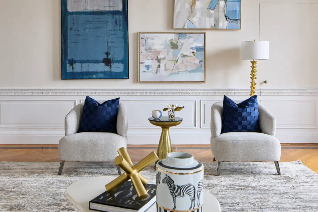
While we love big, bold statement pieces on the wall, it’s also fun to experiment with multiple smaller pieces. If you’re looking for something to fill up a medium-sized wall space, think two instead of one! In this dining room, we centered two small square pieces evenly between the table. It still makes a statement, but it’s a little more subtle and keeps much of the wall space open, making the room appear larger.
Photo Credit: Cathy Hobbs. Designed by Cathy Hobbs Design Recipes
What do you think of this look? Let us know!
Are you on social media? I would love to connect with you! Feel free to reach out to me on any of these platforms!
Be sure to also LIKE Cathy Hobbs, Interior Designer on FACEBOOK
and Follow Design Recipes on TWITTER
As well as Cathy Hobbs on PINTEREST
And Design Recipes on INSTAGRAM
Plus enjoy our Design Recipes How-To-Videos on YOU TUBE


