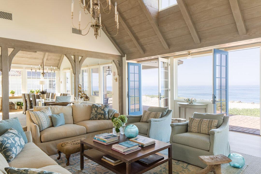
Architects and interior designers use a basic set of building blocks when creating. They apply principles and elements to design beautiful objects, satisfying a human instinct for visual order. The elements are the individual tools used to create, while the principles are the guidelines that dictate how they’re used. This has been the basis of architecture for thousands of years. Structures from the Pantheon in Rome to Gothic cathedrals the world over all utilize the same set of rules. The big question is, how do we apply these architectural principles to an ordinary house? You’ll be surprised to find that you’re already using them. All you need to do is reinforce those principles. Have you ever walked into a room and instantly thought it was beautiful? The room probably used a few of these classic rules, successfully appealing to your natural penchant for order.
Line
Using line weights is an easy element to apply to a room that needs a little extra fine-tuning. Vertical pieces, like a tall freestanding lamp, will give the impression of a column, causing your eyes to track upward. This effect can also be achieved with large plants, mirrors, or long curtains.
The use of horizontal lines can visually connect the whole room, and bring the room’s height down to human scale. Something as simple as a few floating shelves will enable your eyes to track horizontally around the space, giving the perception of a more expansive room. Another way to make your room look bigger is to hang up slightly oversized pictures in a landscape orientation, longer in width than height.
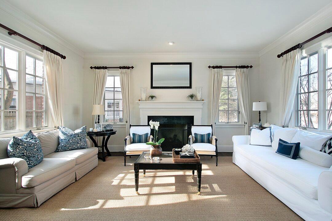
Traditionally, houses use large baseboards and decorative crown molding to visually expand a room, while giving the perception of a lower ceiling height. Before air conditioning became commonplace, ceilings were high, allowing heat to rise and the space to naturally cool down. Many older homes used a broad decorative molding, making use of multiple horizontal lines to provide the illusion of additional space. Within your own home, you should also think about the trimming and surfaces. The ceiling’s design is important, since it houses lighting and reflects daylight. On the walls, you can use color, pictures, and other decorative elements to show your personality.
Scale
The floors are where you arrange your furnishings, and the placement of rugs can help organize how you circulate within the space. To arrange your furniture for maximum circulation, first check if the scale of the furnishings fits within the space. Always add large furniture for large rooms, and small items for cozy quarters. If your sofa is long, choose a series of three frames or canvases and arrange them vertically behind the sofa. If your sofa is smaller, add one sizable horizontal art piece behind it. Make the entire sitting area a focal point for the room. You can do that by using carpet tiles if the room has solid-surface flooring. Consider getting a modular rug fit for the furnishings, which can emphasize a well-planned social area.
Light and Emphasis
The element of light is about more than just installing a fixture. It’s the daylight streaming from the windows, the reflection from the walls, and the brightness of the bulbs. If your room has dark-toned walls, you’ll need brighter lights, additional fixtures, and lighter-colored furniture. Dark tones absorb light, so you’ll need higher lumen bulbs—a unit of measurement for the amount of light emitted per second—to increase the brightness of the room.
With light-color painted rooms, take note not to over-illuminate. A space that’s too bright will wash out the colors of your furnishings and overstimulate your eyes.
For ceiling fixtures, look for a simple geometric shape. A round or oblong fixture offsets the linear elements within the room. Also, light fixtures can direct your eyes to other design features in the same space. That’s why a large chandelier above the dining room table is often a popular choice. Yes, its purpose is lighting, but it signifies the importance of the room as a congregation point—an example of the principle of emphasis. Tight-knit quarters might require a smaller hanging fixture to bring the ceiling’s visual height down.
In a bedroom, you might add a surface-mounted light to distribute a softer glow across the ceiling. Reflected light in bedrooms should have a calming effect, rather than bright direct lighting. Use soft ambient lighting to help you relax. Reading areas and the kitchen would require task lighting—light for performing specific tasks.
Color
Color is an element that freshens and updates a space. Try finding a few pieces of decor that contrast with the room’s main color. Look for framed pictures, rugs, and shelves to see where you can add visual interest based on color. Some people find that arranging their bookshelf by color creates an exciting series of patterns. Also look for items that relate to your personal interests. Frame a map, find an old camera, or place a vase full of colorful objects on the table. If you select interesting decorative items, you’ll always have excellent conversation starters.
You’re probably already using some principles and elements of design throughout your home. We all use them, because natural order is in our DNA. We intuitively apply the principles when arranging furnishings, organizing shelves, or hanging pictures. When these design tools are used effectively, spaces will engage your eyes and create positive emotions.
Pro-tip:
As you design, think holistically. All walls and surfaces need to be part of a successful design. Think about how each element fits within the context of the whole room.
Travis Kelly Wilson is an interior design professor at Western Kentucky University. He is the author of a book series for young children, “The Aspiring Architect.” He and his wife reside in the beautiful town of Falls of Rough, Kentucky, and enjoy traveling the world exploring architecture.