NEW YORK—Dressed in all black, Massimo Vignelli, the legendary designer of the 1972 NYC subway map, sat quietly as he listened to his associates introduce the beginnings of his iconic map at a Transit Museum talk on Sept. 12. Then, almost suddenly, he broke out into an impassioned speech that covered all the points of their presentation, while forgetting to show the PowerPoint presentation.
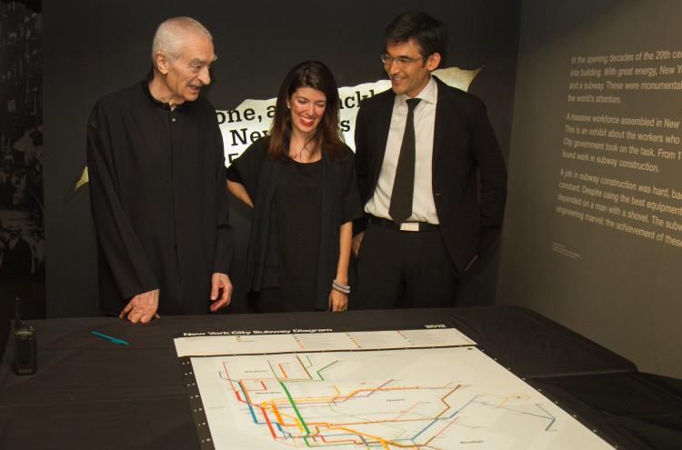
Vignelli, 81, has lost some weight over the years, but he has not lost any of his winsome humor. He called all the complicated maps—before and after his—“a disease of people who don’t know how to design diagrams.” He is a man who dedicated his whole life to simplicity.
Vignelli started the Vignelli Office of Design and Architecture in Milan with his wife Lella Vignelli in 1960. In 1965, they began to work with Unimark International Corporation, doing signage designs for the subway system. Six years later, Vignelli Associates was founded, creating the subway diagram for New York City in 1972.
Before Vignelli, subway maps used to emphasize geographic accuracy between stops, resembling a maze of tangled angles.
Vignelli introduced the idea of using lines that ran at 45-degree and 90-degree angles instead. His angles continued to be incorporated into the present subway maps. “You’re going from point A to point B, who cares if the subway line curves like this,” Vignelli said, adding a comical dance with his arms to illustrate the dramatic curves.
Vignelli also simplified the map by taking out the names of streets, centers, and rivers because he felt that the information was irrelevant to subway riders who could not choose to get off between stops. His map consisted of lines and dots. “No dot, no stop—it’s simple,” he said.
Having so many geographical elements taken out, however, can cause riders to have difficulty finding stops above ground.
To prevent this problem, Vignelli originally created four complimenting maps. He created the subway line diagram, a geographic map of the entire network, a geographic map of the local neighborhood, and a verbal map that explained in words how to get from one place to another. The MTA, however, only asked for one map, so it only incorporated the diagram.
During a time before smartphones, the single diagram led to a lot of confusion for travelers who did not know where to go to find a station above ground. The diagram also had other problems such as having the 50th Street Broadway station appear on the west side of Eighth Avenue when it is actually to the east, and drawing Central Park as a square instead of a rectangle so that it would be more aesthetically pleasing.
Hence, in 1979, Vignelli’s map was replaced and redesigned by someone else to incorporate more geography and accuracy. “The map after ours was horrible, it had too much information,” Vignelli half-joked. “I was shocked, disappointed, but eventually I got over it.”
Perpetual icon
Although Vignelli’s map was only in use for nine years, its image became timeless.
In 2008, Men’s Vogue requested to feature the diagram in its magazine. They wanted the map to maintain its style, but be updated to reflect present day stations.
“Designing maps is a disease, it always comes back,” Vignelli said. Memories of the “nightmarish,” intense, manual labor that came with designing a map flooded into Vignelli’s mind. “I didn’t want to do it,” he said.
His associates Beatriz Cifuentes and Yoshiki Waterhouse showed enthusiasm however. So together, again, the trio recreated the diagram with laughter, late nights, “and sometimes epic fights,” Waterhouse recalled.
The new version enlarged the dots and got rid of Central Park all together. There were 300 limited editions of the map—which sold out in three hours.
In 2011, Vignelli’s map was chosen as the design for the MTA Weekender App. “After 40 years, finally we can get the four maps in one shot,” Vignelli said. He is particularly fond of the app’s blinking lights that indicate planned work on lines. “It’s terrific, so festive,” he said. “The digital world is amazing.”
At that moment, his microphone began to ring from feedback. Vignelli looked baffled, and held the microphone further. “You have to hold it closer, that’s why it’s making that noise,” Waterhouse reminded.
“Ah, technology,” Vignelli sighed.
The Epoch Times publishes in 35 countries and in 19 languages. Subscribe to our e-newsletter.