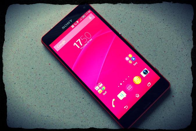
Sony have carved themselves out a niche in the world of modern day smartphones. A niche for great looking, powerful, waterproof and damn good fun to own smartphones. The latest generation having only just been unveiled at IFA in Berlin a few weeks ago, when I saw the red Sony Xperia Z3 Compact I just knew I had to try it out.
Recently for me my life is a battle between huge two handed devices like the OnePlus One or the Oppo Find 7a and smaller devices like the Motorola Moto G and the Xiaomi Mi2S.
Good Points
- Feels great in the hand.
- Nice and lightweight.
- High spec.
- Great sound quality with speakers or headphones.
- Waterproof and dustproof.
- Micro SD slot.
- Decent camera.
Bad Points
- The plastic sides detract from the overall high quality feel.
- Volume and camera button feel a bit naff.
- Quite a bit of Sony bloat pre-installed.
- The camera app has far too many built in apps to be of use.
- The camera is basically the same old camera from the previous generation with a few tweaks.
Design
The Sony Xperia Z3 Compact or Z3C as I'll call it from now on, is a great looking piece of kit. It is a mix of nice soft touch plastic, some underlying metal and two panes of glass. I was quite surprised when I took the Z3C out of its box, mainly because small devices always surprise me and also that the edges were made of plastic.
I had seen them on various hands on videos from IFA but seeing it in the flesh was quite a shock. Not that the translucent plastic doesn’t look nice, I just expected something a little bit more premium feeling.
The sides of the Z3C are made of a soft touch translucent plastic, which is convex so if you were to drop the phone it might protect the phone much like a bumper case would. I did say might though, you'd more than likely smash the glass if you dropped it.
The left hand side house two flaps and the magnetic charging point. The top flap houses the Micro SD slot and the Micro USB charging port. The bottom flap houses the Nano SIM slot. Both flaps are opened from the ends with this generation as opposed to the sides. This might help phantom opening, I don’t really know yet.
The right hand side of the phone is where you find the various buttons, arranged in the same order as before, the round power button at the top, volume rocker just below that, some may say almost too close to the power button and then the camera button at the bottom.
The camera button still triggers the camera from sleep or within any app, which is quite handy. The volume and camera buttons are made of plastic this time round, in the same colour as the side panels, if anything these buttons add to the “Not as premium as I‘d hoped for” feeling I have with the Z3C. If they were metal like the power button it’d be better.
The top and bottom of the phone don’t really hold many surprises; the top has a microphone and the headphone socket. The bottom has another microphone hole.
The front of the phone is pretty basic, the Z3C now has front facing stereo speakers, which are inset from the edge. The back of the phone is a sheet of coloured glass, which feels nicer than last years plastic back. The back bares branding for Sony, Xperia, NFC and also the camera and flash are in the top left.
Overall the Z3C looks nice, it feels nice and you can use the entire screen with one hand, which is always fun.


