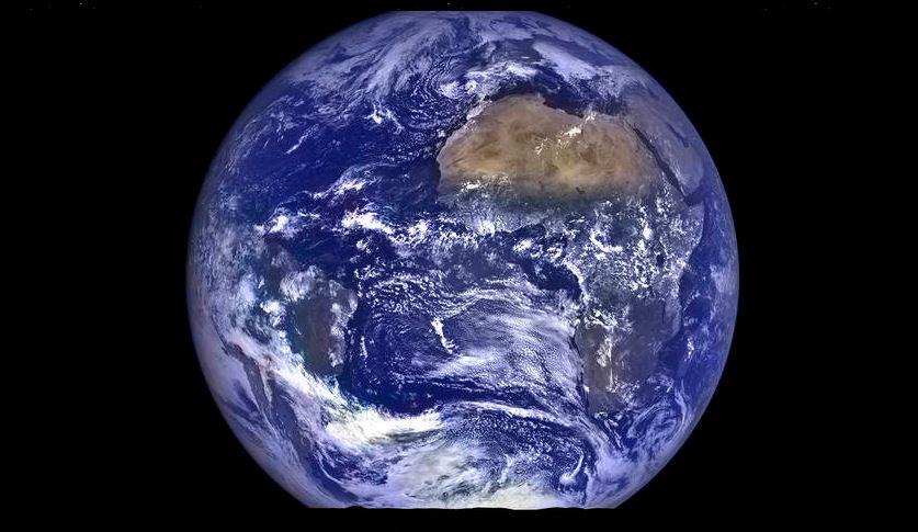
A map shows the world’s population in a stunning three-colored division.
The red part actually represents 5 percent of the global population, and the blue region also represents 5 percent of the world population.


A map shows the world’s population in a stunning three-colored division.
The red part actually represents 5 percent of the global population, and the blue region also represents 5 percent of the world population.