Owners of Apple’s Mac computers were able to access the pre-release versions of Yosemite following the developer conference in much the same way as Windows users have been invited to test the ‘Technical Previews’ of Windows 10 which will go on to replace Windows 8.1.
As part of the overhaul of OS X found in Yosemite, it contained a new version of iTunes that has since also appeared on Windows. Given the seemingly radical redesign of iTunes 12 even on Windows, it is worth taking a close look at the software. iOS 7 was an extremely divisive change in overall aesthetic, and iTunes 12 is certainly inspired by the same line of thinking.
Appearance
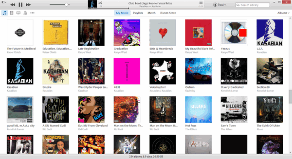
The greys of older iTunes builds have been abandoned for a much lighter colour that merges nicely with the stark white of the various grids. Typography has been revised as well, and things are generally more fitting with the iOS 7 UI. While iOS 7’s appearance has been polarizing, iTunes 12 seems to rein things in for a more inoffensive appearance.
The biggest change comes to the Album Grid and how it handles artwork. Rather than trying to blend them in, it uses hints of their color to determine everything else. iTunes 11 created some near-unreadable color mixes because of album covers using specific tones, but so far, 12 has done a far better job of creating something attractive.
Changes
While iTunes 11 allowed you to restore an appearance reminiscent of older versions by displaying the sidebar, 12 does not. Ctrl+S, the shortcut previously set aside for this, does nothing. Therefore, you’ve no real choice but to use the options running along the top of the window.
The menus are still accessed via the tiny button in the upper left – but can also be accessed via the more conventional bar that is revealed by pressing Ctrl+B.
Apple has also seen fit to simplify the display of different features, such as Tones, Apps and Podcasts. In older versions of iTunes it was slightly more convoluted; now it’s as easy as clicking the three dots and picking what you'd like to have listed.
Sorting displays has also been made easier: we previously covered accomplishing this via Ctrl+J, but like the sidebar, this has been changed. Utilising the view options, you can make the same changes. It’s much more appealing looking, for obvious reasons.
Only one change left us scratching our heads; as far as we can tell it’s normal behaviour. When dragging and dropping media to your iOS device you highlight it, then sweep to the right – do that in iTunes 12 and you'll have made a mistake, for the pop-in column is now on the left.
It’s not a major change, but it’s certainly a disconcerting one. You’ve no real alternative either given that the sidebar is not an option anymore.
Overall
Nobody expected iTunes 12 to completely reinvent Apple’s software; in many ways it feels like 12 is a visual refresh for 11, making a greater layer of refinement rather than a brand new tool. Thus, we feel it’s inoffensive enough to work for the majority of users.
In the event that you'd rather modify iTunes as we demonstrated recently, holding off is utterly essential. No skins yet exist, and those created for iTunes 11 will have many, many compatibility errors if you can even force them to work. The vast majority won’t miss these features, and for them we have no other verdict than to go ahead with an update.
Republished with permission from MakeTechEasier. Read the original.