Cheryl and David, two busy executives with three teenagers, sought a source of serenity within their home, which is nestled on a 1.5-acre ravine lot.
“Life is hectic and I wanted a space that I could call my own,” Cheryl says. “My focus was to finally have a master bedroom and bath that offered me calmness and functionality.”
Communication is key to the collaboration between designer and client. “Sandra got to know us. The trust was there for her to manage the project,” recalls Cheryl of designer Sandra Nash, from Making a Scene.
Originally painted all white, the master bedroom, ensuite, dressing room and entry hall, as well as the bedroom’s second storey loft, lacked the contemplative spaces the homeowners craved. “The overall look I asked for was timeless and it had to be livable,” Cheryl says.
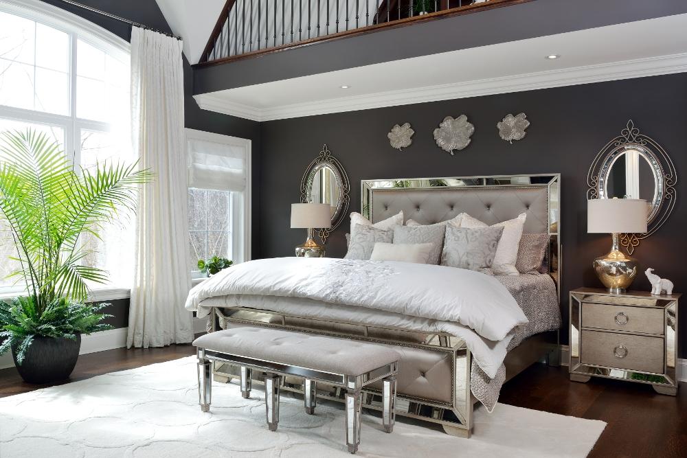
Now the bedroom’s aesthetic is reminiscent of a 1930s Hollywood film set with a sprinkling of Victorian era design motifs. The mirrored bedroom suite is grand and elegantly feminine with a headboard tufted in a pearlized grey fabric. The bed’s coverlets and cushions echo the Art Deco geometrics of the bed, side tables, and wool rug.
White accessories and silvery metals gleam against the deep grey paint that tailors the walls. White also stylizes the bedroom’s millwork, transforming it into architectural statements. Sculpted and tufted, the chaise lounge, with its cashmere throw, provides Cheryl with a private pocket of luxury, a nook to read in.
“Don’t wait to sell your house to stage it. Design for how you live now,” Cheryl advises.
“Adding textiles is practical because of their sound-absorbent qualities. Draperies also provide light control, privacy, and energy savings,” Sandra notes.
Dramatic 12-foot silk-embroidered drapes grace the bedroom’s central window tableau, while hobbled Roman shades made of linen accentuate the side windows. These window treatments invite ravine views, but also heighten David and Cheryl’s privacy.
The entire redesign took four months. Cheryl advises, “Be patient, and understand that bathrooms have many trades involved. Make sure your designer can give a clear timetable of when things are to be completed.”
A study of lightness and brightness, the ensuite bathroom uses modernized Victorian motifs in the metal furniture’s curlicues, grommeted drapery panels, as well as the shower and bathtub fixtures. Creative contrasts enhance the white room’s personality. Sandra’s use of crystal finials on the curtain rods, cow hides on the Calacatta marble floor, and chandeliers add whimsy.
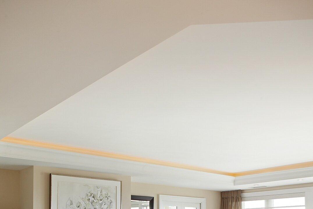
“A chandelier in the bathroom and toilet room adds an elegant and romantic feel to a space so integral to unwinding, especially while bathing, as the first thing you do in a tub is look up,” Sandra says. The ceiling, painted the same grey as the bedroom, provides continuity throughout the rooms.
“Don’t forget your fifth wall—the ceiling,” she adds.
“Sandra gave us exactly what we were looking for,” says Cheryl. “My breath was taken away and I cried when she made the reveal. All our expectations were exceeded. We never imagined it could be this spectacular.”
Canadian Home Trends Magazine gives you a personal tour of the most stunning homes and condos. In each issue, you are given the tools to recreate designer spaces you’ve always dreamt of having at home, in-depth renovation and design advice, and the best places to shop. To subscribe, visit www.CanadianHomeTrends.com
Sources:
- Space designed by Sandra Nash, Making a Scene, www.making-a-scene.com
- Mirrors: Uttermost, www.uttermost.com
- Metal flowers: Bowrings, www.bowring.com
- Drapery fabric: Alendel, www.alendel.com
- Mattress: Sealy, www.sealycanada.com
- Art: Leftbank Art, www.leftbankart.com
- Bench: Korson Furniture, www.korsonfurniture.com
- Chaise lounge: Korson Furniture, www.korsonfurniture.com
- Carpet: Surya Rugs, www.surya.com
- Custom window coverings, pillows and throws: Making A Scene, www.making-a-scene.com
- Light fixtures: The Lighting Center, www.lightcentre.ca
- Bedding: Eastern Accents, www.easternaccents.com
- Heated floor in bathroom: Nuheat, www.nuheat.com
