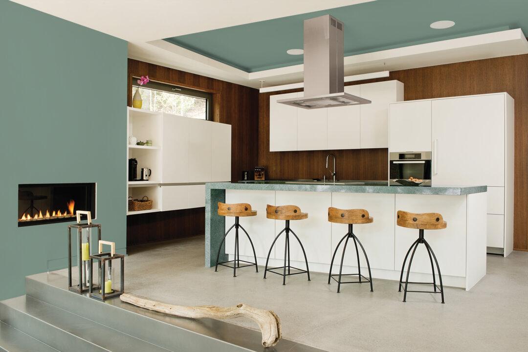
When we start thinking “spring,” one colour comes to mind. Tender pea shoots, that soft fuzziness on budding trees, a new lawn—there’s a palette of greens that herald nature’s shift to the warm seasons.
And there are many fresh ways to bring green indoors with paint and furnishings.
“Green is Mother Nature’s favourite colour. It’s so abundant in the world around us that we’re accustomed to seeing it as a background colour,” says Lee Eiseman, head of the Eiseman Center for Color Information and Training near Seattle.
She also points out the “good-for-you” connotations of green—eating fruits and vegetables, juicing and so on—and the generally calming nature of the hue.
“We’re looking for that restful shade to bring the outside in, and provide balance in our lives,” she says.
Dee Schlotter, the spokesperson for PPG Brands, design and colour marketers and makers of PPG Paints, says, “Green is restorative, rejuvenating and fresh. Being in nature brings an ease or a relaxation that’s almost immediate. Recreating that feeling in the home is very popular right now.”
The company has chosen Paradise Found as their 2016 colour of the year. It’s a soothing gray-green with a hint of blue.
Greens like this play well with others. Combining gray-green with matte black modernizes a traditional space. Paired with white, the colour becomes more mineral and organic.
Farrow & Ball has a new, leafy, verdant hue with historic provenance to help commemorate the paint maker’s 70th anniversary.
“Yeabridge Green was originally found in an 18th century Georgian farmhouse in the (United Kingdom) county of Somerset,” creative director Charlie Cosby recalls. During renovation, an original gun cupboard was removed, revealing the paint colour.
Rich and earthy, it’s a green in the family of avocado, olive and evergreen.
Crate & Barrel’s Marin collection of artisan-made stoneware comes in a relaxed yet sophisticated lemongrass shade. There’s a soft wool rug named Baxter in the hue as well. (www.crateandbarrel.com )
If you’re trying green for the first time, Eiseman advises looking at the blue-greens. “They’re the most universally pleasant and least risky,” she says. “Particularly teals and deep turquoise.”
West Elm has a little midcentury-style desk and wooden counter stools in a gentle blue-green they’re calling “oregano.” (www.westelm.com )
CB2 has a sleek, low-profile dresser done in high-gloss mint lacquer. They also have a mint, powder-coated steel filing cabinet, and an array of minty trays, vases and napery. (www.cb2.com)
Saturated shades like chartreuse, citron and lime give a “pop” to walls and home accessories. At All Modern, find bold, zigzag-printed throws and slipper chairs from Amity Home, Deny Designs and Handy Living. (www.allmodern.com )
Kitchenaid’s mixers and tools come in a fresh apple green. (www.kitchenaid.com )
Looking for other colours with which to pair green?
“Reach across the colour wheel and choose the complementary colours,” Eiseman says. “It’s the rose tones, wines and warm purples that are very effective with shades of green.”


