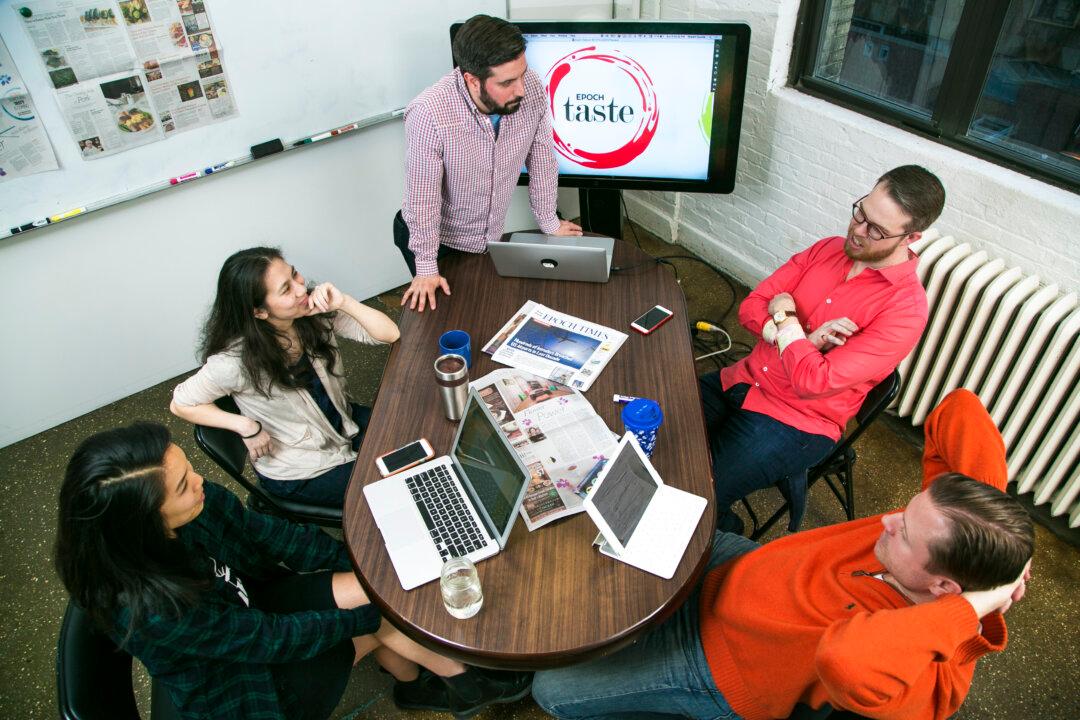
Epoch Times Creative Director Rob Counts recounts the process and the iterations—the good, the cheesy, and the one that drew immediate consensus from the room (never has he seen a logo agreed upon as quickly):
Fire
First, fire—for obvious reasons. The problem with fire is it represents symbolically many different things. … Fire can be fun but just as quickly can become cheesy. The logos I was producing were extremely cheesy. In one of them, the word “Taste” was on fire. It looked like it was a logo for some zany auto show.
Social
The next one we discussed was the social side to food. Food is what brings people together, what brings families together, it’s how people celebrate through food. You eat and your body rejoices—that celebration as well. Funny enough, that social logo was very hip, and my mother liked that the most. It means my mom is younger than she tells me she is or it was a good logo that would appeal to everyone.
Crumbs
Then, crumbs: what’s left on the plate, organic food particles. I made a beautiful logo from that. In the end, though, the crumbs could too easily be skewed as being leftovers. You want people to feel like it’s fresh and something you'd want to dig into. Looking at this, it evokes that sad feeling you get when you show up at a restaurant and your friends have eaten all the food and you have to order and wait.
Finally: Plating
Plating is one of the most beautiful things I can think of when it comes to a dining experience. Seeing a balsamic reduction poured beautifully around a filet or a raspberry reduction poured around a dessert makes my mouth water every time I think about it … and I don’t think I’m alone in that feeling. It’s simultaneously appetizing and surprising. It brings food out of its normal basic function of providing sustenance and adds in something very human and beautiful into the process. It makes food into art. I found a lot of excellent photography of great food plating. Then I started drawing.The concept was to have “TASTE” in the middle as the entree. Over the course of three days I meticulously drew the reduction around it, using the references that I found. The funny thing is, you'd probably never know it took that long, since it looks really organic. But I really had to make it look and feel like reduction. Eventually it started to look like something I wanted to eat—that’s how I knew it was starting to get to the right place. I wanted top chefs to look at it and have smiles on their faces.

I hope that people appreciate the attention we’re putting into the new logo. It represents the attention we’re putting into our all new Epoch Taste section.
Everyone on this team—not only are we writers and artists but we share a love for food. We’re creating what we’re eating and drinking. We’re as excited to make this as awesome as hopefully our readers are about going out and eating the things we’re writing about.